

✨ 使用现代 CSS 属性实现 3D 卡片悬停效果 😍
🚧 创建 HTML 标记
🦋所有元素的基本样式
😉 打造真正的 3D 悬浮效果
在这篇文章中,我们将使用 HTML 和 CSS 创建一个非常漂亮且独特的 3D 卡片悬停效果。我们将使用一些现代 CSS 属性来实现这个效果。以下是本文将要创建的效果演示 -
我们将按以下步骤进行:
- 创建HTML标记。
- 为所有元素添加基本样式。
- 营造真实的悬停效果。
首先,让我们添加所有HTML代码来构建所需的结构。
🚧 创建 HTML 标记
<body>
<h1 class="heading">3D Card Hover Effect</h1>
<div class="container">
<div class="item">
<div class="card"><img class="card__img"
src="https://images.unsplash.com/photo-1588392382834-a891154bca4d?ixid=MXwxMjA3fDB8MHxzZWFyY2h8NXx8bmF0dXJlfGVufDB8fDB8&ixlib=rb-1.2.1&auto=format&fit=crop&w=500&q=60"
alt="Green Forests">
<div class="card__content">
<h1 class="card__header">Green Forests</h1>
<p class="card__text">Lorem ipsum dolor sit amet, consectetur adipiscing elit. Morbi id sem sit
amet massa aliquet aliquet. Phasellus at ipsum
congue urna commodo gravidas</p><button class="card__btn">Explore
<span>→</span></button>
</div>
</div>
</div>
<div class="item">
<div class="card"><img class="card__img"
src="https://images.unsplash.com/photo-1505245208761-ba872912fac0?ixid=MXwxMjA3fDB8MHxzZWFyY2h8Mzd8fG5hdHVyZXxlbnwwfHwwfA%3D%3D&ixlib=rb-1.2.1&auto=format&fit=crop&w=500&q=60"
alt="Beutiful Oceans">
<div class="card__content">
<h1 class="card__header">Beautiful Oceans</h1>
<p class="card__text">Lorem ipsum dolor sit amet, consectetur adipiscing elit. Morbi id sem sit
amet massa aliquet aliquet. Phasellus at ipsum
congue urna commodo gravida</p><button class="card__btn">Explore
<span>→</span></button>
</div>
</div>
</div>
<div class="item">
<div class="card"><img class="card__img"
src="https://images.unsplash.com/photo-1431512284068-4c4002298068?ixid=MXwxMjA3fDB8MHxzZWFyY2h8OTB8fG5hdHVyZXxlbnwwfHwwfA%3D%3D&ixlib=rb-1.2.1&auto=format&fit=crop&w=500&q=60s"
alt="Snowy Mountains">
<div class="card__content">
<h1 class="card__header">Snowy Mountains</h1>
<p class="card__text">Lorem ipsum dolor sit amet, consectetur adipiscing elit. Morbi id sem sit
amet massa aliquet aliquet. Phasellus at ipsum
congue urna commodo gravida</p><button class="card__btn">Explore
<span>→</span></button>
</div>
</div>
</div>
</div>
</body>
这里我们有div一个class“容器”,它将作为所有三个卡片的父元素。然后,每个“卡片”都位于“容器”内,div并包含class
一个“项目”。每个“卡片”div都有自己的图片、标题和一些相关文本。此外,它button内部还有一个“项目”。
这就是我们要构建的网页的基本HTML标记。
现在,让我们为所有元素添加一些样式,例如“卡片”、img卡片内的文本、按钮以及卡片的布局样式。
🦋所有元素的基本样式
以下是这些元素的样式 CSS 代码 -
*,
*::before,
*::after {
    margin: 0;
    padding: 0;
    box-sizing: inherit;
}
html {
    box-sizing: border-box;
    font-size: 62.5%;
}
body {
    padding: 6rem;
    background-color: #15202b;
    color: white;
    font-family: "Inter", sans-serif;
}

.heading {
    font-size: 4rem;
    text-align: center;
    margin-bottom: 3rem;
    text-shadow: 3px 4px 5px pink;
}

.container {
    display: flex;
    justify-content: space-around;
    align-items: center;
    flex-wrap: wrap;
}

.item {
    background-color: #192734;
    border-radius: 0.4rem;
    overflow: hidden;
    cursor: pointer;
    width: 30%;
    transition: .5s all ease;
    box-shadow: 0px 20px 50px #555;
}
.card__img {
    display: block;
    width: 100%;
    height: 18rem;
    object-fit: cover;
}
.card__content {
    padding: 3rem 3rem;
}
.card__header {
    font-size: 3rem;
    font-weight: 500;
    color: #fff;
    margin-bottom: 1.5rem;
}
.card__text {
    font-size: 1.5rem;
    letter-spacing: 0.1rem;
    line-height: 1.7;
    color: #8899a6;
    margin-bottom: 2.5rem;
}
.card__btn {
    display: block;
    width: 100%;
    padding: 1.5rem;
    font-size: 2rem;
    text-align: center;
    color: #3363ff;
    background-color: #e6ecff;
    border: none;
    border-radius: 0.4rem;
    transition: 0.2s;
    cursor: pointer;
}
.card__btn span {
    margin-left: 1rem;
    transition: 0.2s;
}
.card__btn:hover,
.card__btn:active {
    background-color: #dce4ff;
}
.card__btn:hover span,
.card__btn:active span {
    margin-left: 1.5rem;
}

@media (max-width: 992px) {
    .item {
        width: 45%;
    }
}

@media (max-width: 768px) {
    .item {
        width: 80%;
    }
}
以上就是网页样式所需的所有基本样式。接下来,我们将学习如何使用 一些有趣的 CSS 属性来创建真正的3D 卡片悬停效果。
😉 打造真正的 3D 悬浮效果
首先,为了给卡牌赋予起始位置,我们将添加transform一个属性,其值为rotateX(45deg) scale(0.7)。现在这里
rotateX()- 该rotateX()方法使元素绕其 X 轴在三维空间中以给定的角度旋转。scale()该scale()方法可以增大或减小元素的大小(根据给定的宽度和高度参数)。这些方法会使我们的元素绕 X 轴旋转 45 度,同时将其大小减小到原始大小的 0.7 倍。```css
变换:rotateX(45deg) scale(0.7);
Now by adding this line we won't get our initial positions of our card , instead we will get it as below -
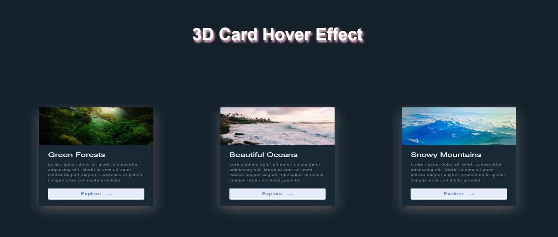
from which it looks like item is scaled down to 0.7 of its original size but it doesn't look like it has rotated through 45 degrees around X-axis. But it did. It doesn't look like rotated because while doing 3D transformation we have tell browser that how far is that item from the user's eyes. And to do that we can use `perspective` property in CSS.
### 🧐Perspective In CSS
1.The `perspective` property is used to give a 3D-positioned element some perspective.
2.The `perspective` property defines how far the object is away from the user. So, a lower value will result in a more intensive 3D effect than a higher value.
3.When defining the `perspective` property for an element, it is the CHILD elements that get the perspective view, NOT the element itself.
To learn more about `perspective` in CSS and other properties related to it like `perspective-origin` [Click Here](https://developer.mozilla.org/en-US/docs/Web/CSS/perspective)
So now to get desired positioning of our items , we will add `perspective` property to container which is a parent of item components and set its value to `900px`(While using perspective you should try and test values to get desired look).
```css
.container {
perspective: 900px;
}
现在,我们的卡片将呈现正确的初始外观,如下所示—— 最难的部分已经完成。现在我们只需要为卡片添加悬停状态,也就是卡片的正常位置,为此我们将属性设置为。
transformrotate(0deg) scale(1)
.item:hover {
    cursor: pointer;
    transform: rotate(0deg) scale(1);
    transition: .5s all ease;
    z-index: 400;
    box-shadow: 0 2px 2px rgba(0, 0, 0, 0.16);
}
至此,我们精美炫酷的3D 悬停效果就完成了。我知道perspective属性可能有点难懂,但只要多练习例子、多阅读文档,你就会逐渐掌握。
想了解更多编程相关的文章,欢迎访问我的
个人博客。
希望这篇文章对大家有所帮助。感谢阅读,一如既往!😇