展示开发:RaspberryPi Weather ⛈ 由 Netlify 函数和 Preact 提供支持
✨ 结果
🚀 Netlify 函数
⚙️ 使用 Web Workers 设置定时器
🎨 CSS
🍒 树莓部分
🔥💥 砰 💥🔥
📚 资源
把一个前端开发人员、一台闲置数月的树莓派和一段隔离期结合在一起,会发生什么?
我住在一个一天之内就能体验四季的城市。所以,我决定用一台旧的树莓派开发一个每日天气预报应用 🔥
✨ 结果
我最喜欢网络技术的一点就是,你可以用它构建任何东西,从网站到移动应用。我希望通过这个小项目展示,只需进行一些修改和优化,你也能用它构建物联网,并获得令人惊艳的效果。
📸 炫酷
浅色模式🌝
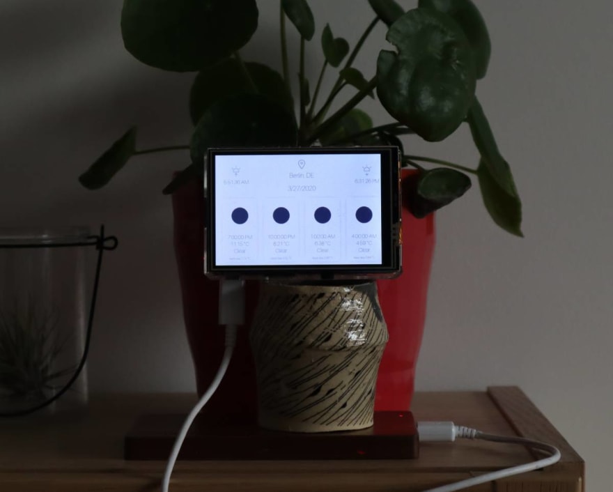
深色模式🌚
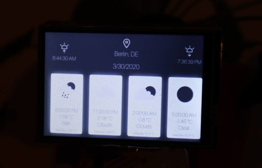
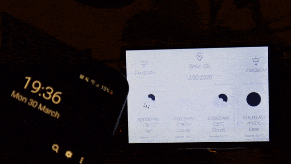
日落时分🌘
🐙 源代码
 moigonzalez / weather-preactpi
一个简洁的每日天气预报用户界面⛈
🚀 Netlify 函数
这是整个项目中最有趣的部分。虽然我只是浅尝辄止地使用了 Netlify 函数,但我已经爱上它了😍。我可以创建一个 Lambda 函数,根据 IP 地址获取用户位置,然后获取该位置的天气。代码如下:
get-weather.js

const fetch = require('node-fetch');
const IPinfo = require("node-ipinfo");
const ipinfo = new IPinfo(process.env.IP_INFO_TOKEN);

exports.handler = async function(event) {
  // The IP comes for free
  const ip = event.headers['client-ip'];

  // IPinfo gives us the location data
  const { _city, _countryCode } = await ipinfo.lookupIp(ip);

  // And finally the weather ⛈
  const weather = await
  fetch(`http://api.openweathermap.org/data/2.5/forecast/? q=${_city},${_countryCode}&APPID=${process.env.OPEN_WEATHER_TOKEN}&units=metric`);

  return {
    statusCode: 200,
    body: JSON.stringify(weather)
  }
}
然后,在客户端,我只需发出一个 HTTP 请求即可获取最终的天气响应:
App.js

const getWeather = () => {
  fetch('/.netlify/functions/get-weather')
    .then(x => x.json())
    .then(res => setWeather(res));
}
最棒的是,在开发环境、测试环境和生产环境中,端点调用都是相同的。🎊
⚙️ 使用 Web Workers 设置定时器
由于 Open Weather Map API 以 3 小时为周期提供天气数据,我希望用户界面能够在有新数据可用时立即更新。通过使用这 3 小时周期,我可以设置 JavaScript 超时来处理这些更新。
此外,我还添加了日落时分显示的深色模式。由于这两个计时器会在客户端并行运行两个超时,我希望每个计时器都在单独的 Web Worker 中运行,以减轻浏览器线程的负载。
为此,我设置了一个工作进程,用于计算距离下一次天气预报发布还剩多少毫秒,并向应用程序发送消息以更新用户界面。第二个工作进程则处理日出日落时间。
App.js

  useEffect(() => {
    if (weather.cod === '200') {
      const timeWorker = new Worker('../../static/update-time-worker.js');
      timeWorker.postMessage(`${weather.list[0].dt}`);

      timeWorker.onmessage = ({ data }) => {
        getWeather();
      }
    }
  }, [weather]);
update-time-worker.js

onmessage = ({ data }) => {
  const end = new Date(data * 1000);
  const start = new Date();

  const timeDiff = Math.floor((end.getTime() - start.getTime()));

  setTimeout(() => {
    postMessage('Update weather');
  }, timeDiff);
};
🎨 CSS
为了确保字体能够根据我的笔记本电脑屏幕的尺寸和分辨率以及(很小的)树莓派触摸屏的尺寸进行缩放,我使用了根据屏幕高度而变化的字体大小:
styles.css

:root {
  --font-size-l: 6vh;
  --font-size-m: 5vh;
  --font-size-sm: 3vh;
}
更改浏览器屏幕尺寸后,会出现以下结果:

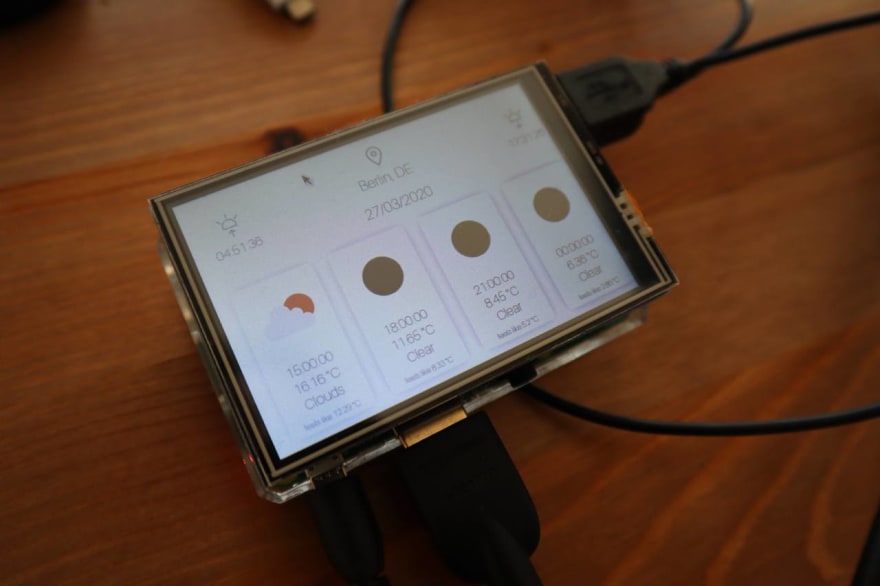
🍒 树莓部分
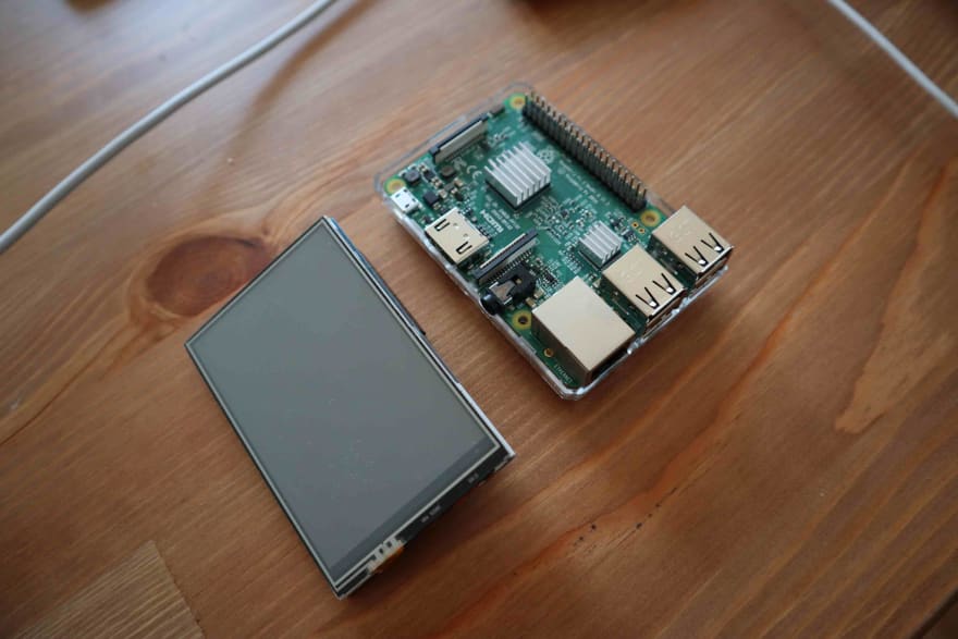
首先,我安装了 Raspbian 系统,因为它预装了 Chromium 浏览器。你可以让这个浏览器全屏运行,并且不显示地址栏,看起来就像一个原生应用。今年三月,Raspberry Pi Imager 发布,它让安装变得非常简单:https://www.raspberrypi.org/downloads/

现在,我想使用我的小型触摸屏,为此我需要一个特殊的脚本来更改启动画面:
git clone https://github.com/goodtft/LCD-show
cd LCD-show
sudo ./LCD35-show

最后一步准备就绪!我们将以全屏模式显示 Chromium 浏览器,不显示导航栏:
/usr/bin/chromium-browser --incognito --start-maximized --kiosk https://weather-preactpi.netlify.com/
🔥💥 砰 💥🔥
📚 资源
https://ipinfo.io/
https://openweathermap.org/
https://docs.netlify.com/functions/build-with-javascript/#format
http://frenetic.be/tricks/simple-timer.php
https://www.youtube.com/watch?v=Fj3wq98pd20
https://blog.gordonturner.com/2017/07/22/raspberry-pi-full-screen-browser-raspbian-july-2017/