如何使用 Flexbox 构建房屋?
我最近学习了 Flexbox,现在是时候为你们——可爱的DEV 社区——做一个实际演示了。
布局就像网站的房子😂
让我们来搭建这个博客布局。
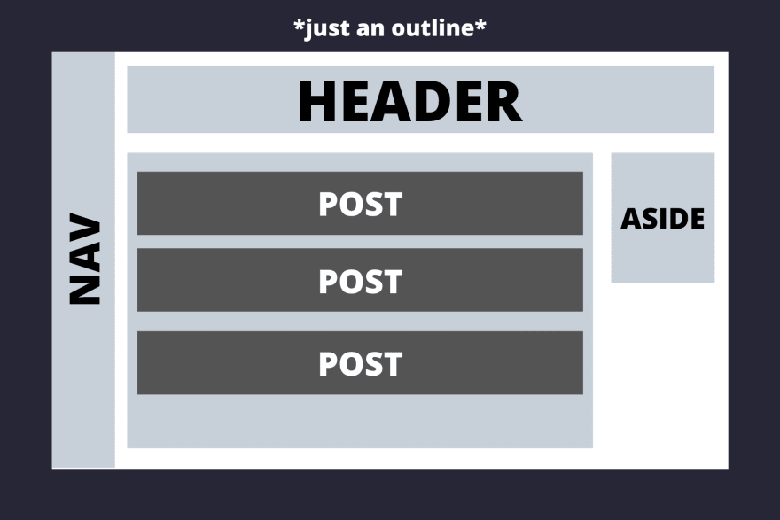
现在让我们一步一步地思考这个问题。
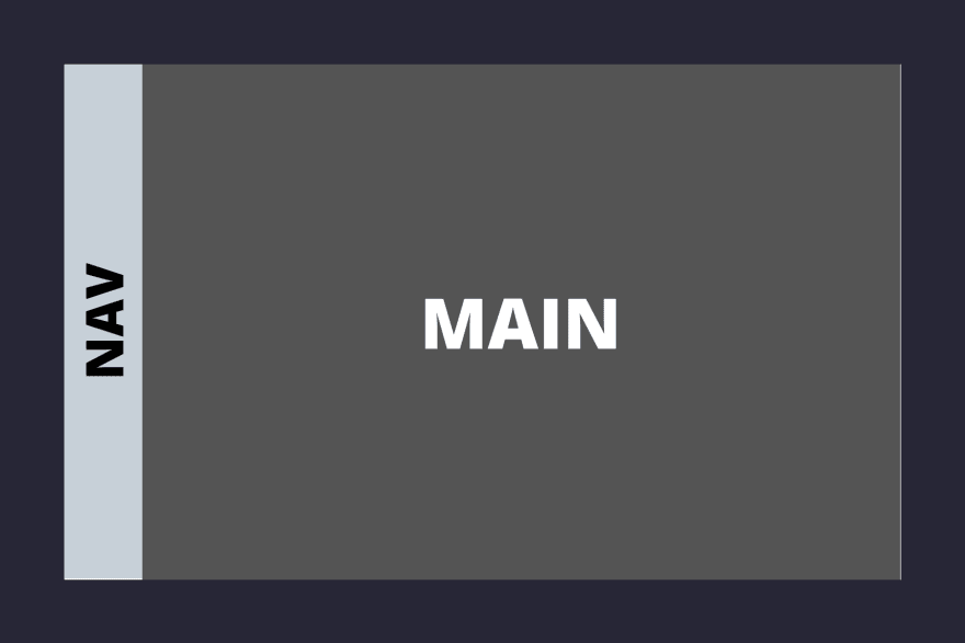
导航栏垂直方向约占整个屏幕面积的十分之一,其余部分则分配给主要区域。
<body>
<nav>NAV</nav>
<main>MAIN</main>
</body>
样式 -
*{
    padding: 0;
    margin: 0;
}
body{
    display: flex;
    flex-direction: row;
    height: 100vh;
    width: 100vw;
}
nav{
    flex-grow: 1;
}

main{
    flex-grow: 10;
}
首先,在 body 元素上添加 ` <div>` 标签,这是必要的,因为要使用 flexbox 布局其中的元素,必须在父容器display: flex上激活 flexbox。flexbox 的对齐方式主要有两种:行对齐和列对齐。行对齐是水平的,列对齐是垂直的。 在本例中,我们希望它们水平对齐,因此添加 `<div> ` 标签。 接下来谈谈 `<div>` 标签,它定义了元素相对于 flex 容器中其他元素的缩放比例。 我们希望元素占据的空间是其他元素的 10 倍,因此在 `<div>` 标签中添加`<div>` 标签,并在`<div>` 标签中添加 `<div>` 标签。flex-direction: rowflex-growmainnavflex-grow: 10flex-grow: 1nav
另一点需要注意的是,父容器的 flex 属性只影响其直接子元素,而不影响子元素内部的元素。
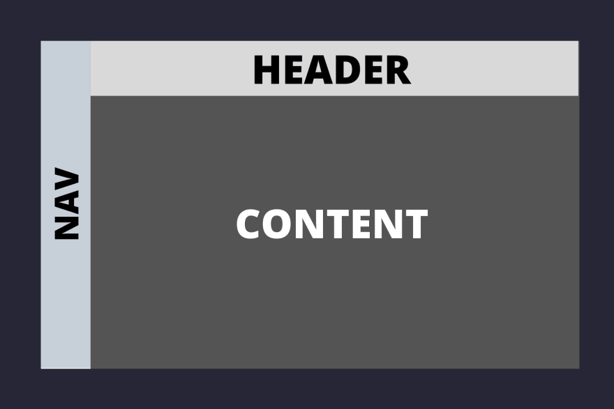
现在我们来看main区域,这就是我们想要做的——
那么,我们该如何实现这个目标呢?
两者header都是content的子元素main,我们需要在main元素上启用 flexbox。
header并且content垂直排列,即排列成一列,其中header约占 1/8 的空间,其余空间留给content容器。
<body>
    <nav>NAV</nav>
    <main>
        <header>HEADER</header>
        <section class="content">CONTENT</section>
    </main>
</body>
/* styles */
main{
    flex-grow: 10;
    display: flex;
    flex-direction: column;
}
header{
    flex-grow: 1;
}
.content{
    flex-grow: 8;
}
当你看到第一张布局图时,你会注意到posts区域aside位于该区域下方.content,所以现在我们需要提高.contents
容器的 flex 布局。这就是我们想要的效果——

        <section class="content">
            <section class = "posts">
            POSTS
            </section>
            <aside>ASIDE</aside>
        </section>
.content{
    flex-grow: 8;
    display: flex;
}

.posts{
    flex-grow: 5;
}
aside{
    flex-grow: 1;
    height: 40vh;
}
同样,按照之前布局部分的方法,我们先将元素添加display: flex到 `.contents` 中,然后使用 `.flex` 属性决定其子元素的比例flex-grow。
现在进入布局的最后一部分,即容器下方的
元素。我认为这是本教程到目前为止最简单的部分。 接下来是我们的父级 flex 容器。individual posts.posts
.posts
            <section class = "posts">
                <section class="post">POST</section>
                <section class="post">POST</section>
                <section class="post">POST</section>
            </section>
.posts{
    flex-grow: 5;
    display: flex;
    flex-direction: column;
}

.post{
    flex-grow: 1;
}
我们只需要打开 flex.posts并指定flex-direction即可column。我们指定flex-grow: 1是.post为了表明每个帖子应该占据相等的空间,还有其他方法可以做到这一点,例如使用justify-content和,align-items但我发现flex-grow是最直观的。
现在布局已经完成,以下是最终代码 -
<body>
    <nav>NAV</nav>
    <main>
        <header>HEADER</header>
        <section class="content">
            <section class = "posts">
                <section class="post">POST</section>
                <section class="post">POST</section>
                <section class="post">POST</section>
            </section>
            <aside>ASIDE</aside>
        </section>
    </main>
</body>
*{
    padding: 0;
    margin: 0;
}
body{
    display: flex;
    flex-direction: row;
    height: 100vh;
    width: 100vw;
}
nav{
    flex-grow: 1;
}

main{
    flex-grow: 10;
    display: flex;
    flex-direction: column;
}
header{
    flex-grow: 1;
}
.content{
    flex-grow: 8;
    display: flex;
}

aside{
    flex-grow: 1;
    height: 40vh;
}

.posts{
    flex-grow: 5;
    display: flex;
    flex-direction: column;
}

.post{
    flex-grow: 1;
}
结论
一旦你理解了 Flexbox,用它构建布局几乎就成了你的本能。提升 Flexbox 水平的最佳方法就是练习。
自顶向下的方法非常适合 Flexbox,首先思考你的主要容器,它们之间的关系,然后再逐步考虑它们内部的内容。Flexbox
还有很多其他方面没有在这篇文章中探讨,例如justify-content, align-items, flex-basis, flex-shrink……等等。继续探索吧!
附注 -当然,对于普通的布局,会涉及到内边距、外边距和颜色,但为了专注于 flexbox,本文省略了这些内容。
文章来源:https://dev.to/manangouhari/building-layouts-with-flexbox-40e