如何设置HTML表单样式
本文包含带有代码的 HTML 表单设计示例。它将帮助您设置 HTML 表单的样式并创建各种自定义输入框。
要创建输入框,请使用 `<input>`<input>标签。该标签内还可以放置多个属性。
type 属性用于确保输入内容的正确验证和正常运行。此属性可以取不同的值:
- type="checkbox" — 用于创建复选框
- type="email" — 用于电子邮件地址(可以向电子邮件字段添加 multiple 属性,以便从多个电子邮件地址列表中选择电子邮件)
- type="file" — 用于上传文件
- type="radio" — 用于进行无线电输入
- type="range" — 此输入将显示为图形滑块(可以添加 min、max 和 step 属性)
- type="tel" — 用于输入电话号码
- type="text" — 用于输入任何文本数据
- ETC。
placeholder 属性指定一个简短的提示,用于描述输入字段的预期值。
`name` 属性用于指定元素的名称<input>。它用于在 JavaScript 中引用元素、在表单提交后引用表单数据,以及确保单选按钮正常工作。只有带有 `name` 属性的表单元素才会在提交表单时传递其值。
aria-label 属性用于定义一个字符串,该字符串用于标记当前元素。当屏幕上不显示文本标签时,请使用此属性。如果元素已有可见的文本标签,则请使用aria-labelledby其他标签。
以下是一些例子。
输入姓名:
<input name="name" type="text" placeholder="Name" aria-label="Name" />
电话输入:
<input name="phone" type="tel" placeholder="Phone number" aria-label="Phone number" />
电子邮件输入:
<input name="email" type="email" placeholder="Email" aria-label="Email" multiple />
该<input>元素通常会附带一个<label>标签,用于显示输入框的标题。要将 `<input>` 元素<label>与 ` <input> <input>` 元素关联起来,需要为其指定<input>一个 ID。<label>然后,`<input>` 元素需要一个for属性,其值与输入框的 ID 相同。
<label>Name
    <input name="name" type="text" aria-label="Name" />
</label>
基本输入样式
所有浏览器都会为输入框应用各自的样式。要重置这些样式,您需要添加以下规则:
input {
  outline: none;
  user-select: none;
}
该outline: none;属性会移除输入框的默认轮廓。此外,该user-select: none;属性还会阻止点击元素时使其高亮显示。
接下来,您可以应用自定义样式:边框、背景、颜色等等,还可以添加伪类来根据用户操作控制输入样式。以下是一个示例:
input {
  border: 1px solid #a4a4a4;
  padding: 15px 20px;
  border-radius: 4px;
  width: 100%; // set width relatively to the parent container with fixed width
  margin-bottom: 10px;
  background: #f8f8ff;

  &:active, &:hover, &:focus {
    box-shadow: 2px 2px 5px 0px rgba(128,128,128,.7);
    transition: box-shadow .3s linear;
  }
}
结果如下: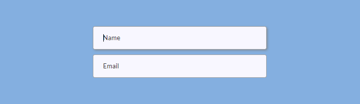
范围输入
输入type="range"内容将以图形滑块的形式显示。您可以生成具有自定义样式的跨浏览器兼容的范围输入框。
首先,准备一些基本的标记:
<p>Set the range<span class="range-data">60%</span></p>
<input type="range" />
要覆盖浏览器的基本样式,您需要将输入框设置为“不可见”:
input[type="range"] {
  -webkit-appearance: none;
  -moz-appearance: none;
  -ms-appearance: none;
  width: 100%;
  border: none;
  padding: 0;
  background: transparent;

  &:focus {
    outline: none;
  }
}
接下来,你需要设置范围输入框的滑块和轨道样式。滑块就是你沿着轨道拖动的部分,轨道就是滑块移动的线条。你需要为不同的浏览器添加不同的样式。设置背景(可以是图片)、大小、圆角半径等等。
input[type="range"] {
  // Chrome, Opera
  &::-webkit-slider-thumb {
    -webkit-appearance: none;
    border: none;
    height: 24px; width: 24px;
    border-radius: 3px;
    background: url(images/range-thumb.png) no-repeat;
    cursor: pointer;
    margin-top: -10px;
  }

  // Firefox
  &::-moz-range-thumb {
    border: none;
    height: 24px; width: 24px;
    border-radius: 12px;
    background: #32557f;
    cursor: pointer;
    margin-top: -10px;
  }

 // IE
  &::-ms-thumb {
    border: none;
    height: 24px; width: 24px;
    background: #32557f;
    cursor: pointer;
    margin-top: 0;
  }
}
为了设置曲目样式,您还可以为不同的浏览器添加规则。
input[type="range"] {
  // Chrome, Opera
  &::-webkit-slider-runnable-track {
    width: 100%; height: 6px;
    border: 1px solid #FFF;
    border-radius: 3px;
    cursor: pointer;
    background: #a4a4a4;
  }

  // Firefox
  &::-moz-range-track {
    width: 100%; height: 6px;
    border: 1px solid #FFF;
    border-radius: 3px;
    cursor: pointer;
    background: #a4a4a4;
  }

  // IE
  &::-ms-track {
    width: 99%; height: 6px;
    cursor: pointer;
    border-color: transparent;
    color: transparent;
    border: 1px solid #FFF;
    border-radius: 3px;
    background: #a4a4a4;;
  }
}
应用这些样式后,您的范围输入框在 Chrome 和 Opera 浏览器中基本会显示成这样(别忘了上传缩略图):

最后,您需要允许用户拖动滑块时更改 HTML 中的数字(60%)。以下是获取范围输入值并将其放入 HTML 中的 jQuery 代码:
$('input[type=range]').val(60); // set initial value
$('.range-data').html( $('input[type=range]').val() + '%' ); // change HTML

$('input[type=range]').on('input', function() {
    $('.range-data').html( $(this).val() + '%' );
});
复选框输入
该type="checkbox"属性会将您的输入内容转换为复选框。
以下是标记代码:
<input type="checkbox" id="whale-shark" autofocus />
<label for="whale-shark">Whale Shark</label>

<input type="checkbox" id="basking-shark" checked />
<label for="basking-shark">Basking Shark</label>

<input type="checkbox" id="bull-shark" disabled />
<label for="bull-shark">Bull Shark</label>

<input type="checkbox" id="blue-shark" checked disabled />
<label for="blue-shark">Blue Shark</label>
Autofocus、checked和disabled是允许设置复选框在不同状态(焦点、选中和禁用)下的样式的属性。
现在我们来创建自定义复选框。首先,display: block;如果您希望复选框以列的形式显示,请将属性应用于标签元素。您还可以添加line-height属性来设置复选框行之间的距离。
label {
  display: block;
  line-height: 1.8;
}
要从视觉上隐藏复选框的浏览器样式,您可以向复选框输入添加属性position。clip
input[type="checkbox"] {
  position: absolute;
  clip: rect(0,0,0,0);
}
现在我们将借助width`h`、height`h` 和background`h` 属性来创建自定义矩形复选框。`h`text-indent属性用于设置复选框标记的水平位置,而 `h` 属性line-height用于设置复选框标记的垂直对齐方式。
input[type="checkbox"] + label::before {
  content: '\a0';
  display: inline-block;
  width: 1.2em;
  height: 1.2em;
  margin-right: .5em;
  border-radius: .2em;
  background: #f8f8ff;
  text-indent: .25em;
  line-height: 1.4;
  border: 1px solid #555;
}
\2713是一个 CSS 符号,表示复选框选中时显示的标记:
input[type="checkbox"]:checked + label::before {
  content: '\2713';
  background: #32557f;
  color: #fff;
  transition: background .05s ease-out;
}
以下是关于焦点状态和禁用状态的其他规则:
input[type="checkbox"]:focus + label::before {
  box-shadow: 0 0 .1em .1em #7eb4e2;
}

input[type="checkbox"]:disabled + label {
  color: #555;

  &::before {
    background: #a4a4a4;
    box-shadow: none;
    color: #555;
    cursor: not-allowed;
  }
}
以下是复选框在不同状态(未选中、选中、禁用、选中禁用)下的最终外观:

要禁用或启用表单元素,请将以下代码添加到您的 JS 文件中:
$ ('.class').on('click', function() { $('.anotherClass').prop('disabled', true); }); // To disable an element
$ ('.class').on('click', function() { $('.anotherClass').prop('disabled', false); }); //To enable an element
.class是一个元素,点击事件可以启用该.anotherClass元素的禁用状态。
无线电输入
与复选框不同,单选按钮一次只能选择一个输入框。要创建单选按钮,请在 `<div>` 标签中添加 `name`type="radio"和 ` name="anyname"name` 属性。您可以随意命名,但请记住,对于所有未禁用的单选按钮,`name` 属性必须相同。否则,您的单选按钮将像复选框一样工作。
以下是标记(<i>用于设置单选按钮圆圈的样式):
<label>
    <input name="radio" type="radio" />
    <i></i><span>Whale Shark</span>
</label>

<label>
    <input name="radio" type="radio" checked />
    <i></i><span>Basking Shark</span>
</label>

<label>
    <input name="radio" type="radio" disabled />
    <i></i><span>Bull Shark</span>
</label>

<label>
    <input type="radio" checked disabled />
    <i></i><span>Blue Shark</span>
</label>
首先,将你的单选按钮输入整理成一列,并设置margin-bottom: 5px(或你喜欢的任何边距):
.radio {
  display: flex;
  flex-flow: column wrap;
}

label {
  margin-bottom: 5px;
}
接下来,为单选按钮的不同状态(选中和禁用)添加规则。别忘了position:absolute添加输入框的属性。
input[type="radio"] {
  position: absolute;
  opacity: 0;

  &:checked + i::before {
    top: 5px;
    opacity: 1;
  }

  &:checked + i::after {
    top: 1px;
    right: 1px;
    bottom: 1px;
    left: 1px;
    background: #f8f8ff;
  }

  &:disabled + i {
    cursor: not-allowed;
  }

  &:disabled + i::before {
    background: #555;
  }

  &:disabled + i::after {
    background: #a4a4a4;
  }

  &:disabled ~ span {
    color: #555;
  }
}
最后,对单选按钮圆圈和点标记进行一些样式设置(这时你的<i>元素就派上用场了)。
i {
  position: relative;
  display: block;
  float: left;
  margin-right: 10px;
  width: 18px;
  height: 18px;
  cursor: pointer;
  background: #4a4a4a;
  outline: none;
  border-radius: 50%;
  z-index: 0;

  &::after,
  &::before {
    content: "";
    position: absolute;
    display: block;
  }

  &::before {
    width: 8px;
    height: 8px;
    border-radius: 50%;
    background-color: #32557f;
    top: 5px;
    right: 5px;
    bottom: 5px;
    left: 5px;
    opacity: 0;
    z-index: 2;
  }

  &::after {
    top: 1px;
    right: 1px;
    bottom: 1px;
    left: 1px;
    background: #f8f8ff;
    border-radius: 50%;
    z-index: 1;
  }
}
以下是单选按钮在不同状态(未选中、已选中、已禁用、已选中/已禁用)下的结果:

选择元素
要创建一个下拉选择框,您可以创建 ` <select><select>` 标签并将选项嵌套在其中。别忘了给<option>`<select>` 标签添加 `value` 属性。
<select name="shark">
    <option value="Whale Shark">Whale Shark</option>
    <option value="Basking Shark">Basking Shark</option>
    <option value="Shortfin Mako Shark">Shortfin Mako Shark</option>
</select>
但是,如果您想应用非常复杂的样式,最好不要使用 `<select>`<select>和 `<select> <option>` 标签。在这种情况下,您可以使用简单的 ` <div><select>` 标签来设置选择元素的样式。
创建一个包装元素(.select-wrap),并将包含选项的下拉选择元素嵌套在其中。您可以为用于下拉选择元素和选项的 div 添加样式.select和类。您可以创建一个额外的元素来设置下拉箭头的样式()。此外,如果您想设置滚动条的样式( ) ,还可以使用额外的元素包裹选项。.options.arrow<div>.options-container
<div class="select-wrap">
    <div class="select">
        <span>Choose your shark</span><i class="arrow"></i>
    </div>
    <div class="options">
        <div class="options-container">
            <p>Whale Shark</p>
            <p>Basking Shark</p>
            <p>Shortfin Mako Shark</p>
            <p>Thresher Sharks</p>
            <p>Bull Shark</p>
            <p>Tiger Shark</p>
            <p>White Shark</p>
            <p>Oceanic Whitetip Shark</p>
            <p>Blue Shark</p>
            <p>Hammerhead Shark</p>
        </div>
   </div >
</div>
首先,您应该将外层容器和选定的 div 元素设置为相对定位。此外,您可能还需要添加其他样式,例如宽度或高度。将外层容器 div 的宽度设置为固定值,并将选定 div 的宽度设置为 100% .select。
.select-wrap {
  position: relative;
  width: 100%;
}

.select {
  position: relative;
  width: 100%;
  height: 48px;
  cursor: pointer;
}
您还可以从“基本输入”部分添加.select边框、内边距、边框半径、宽度和其他属性的其他规则。
接下来,你需要将选项设置为绝对定位,并将 top 和 left 属性设置为相对于.selectdiv 元素的相对位置。top 属性应该与 div 元素的高度相对应.select。样式设置完成后,别忘了将.optionsdiv 元素设置为不可见——点击该.selectdiv 元素时,它应该会显示出来(稍后我们将借助 jQuery 来实现)。目前,你可以将此属性放在注释中,以便查看效果。
.options {
  // display: none;
  width: 100%;
  position: absolute;
  top: 48px; // = height of your .select div
  left: 0;
}
以下是一些无关紧要的规则,您可以根据自己的喜好随意更改:
.options {
  width: 100%;
  border: 1px solid #32557f;
  border-radius: 0 0 4px 4px;
  background-color: rgba(39, 39, 51, .9);
  padding: 2px 3px 2px 16px;
  cursor: pointer;

  p {
    line-height: 1.9;
    color: #FFF;

    &:first-of-type {
      padding-top: 3px;
    }

    &:last-of-type {
      padding-bottom: 8px;
    }

    &:active,
    &:hover {
      color: #7eb4e2;
      transition: color .3s linear;
    }
  }
}
要让你的 div 看起来像一个真正的下拉选择框,你需要添加一个箭头来表明该 div 包含选项。你可以使用以下规则来创建一个向下箭头。`array`border和 ` array_shape`border-width属性将构成箭头的形状,`array_position`、`array_location`position和top` rightarray_location` 属性将箭头定位在.selectdiv 内部,而 `array_location`transform属性将通过旋转 45 度来设置箭头的正确方向(向下)。
.arrow {
  display: inline-block;
  border: solid #555;
  border-width: 0 2px 2px 0;
  padding: 3px;
  position: absolute;
  top: 16px;
  right: 16px;
  transform: rotate(45deg);
}
之后,你需要设置 ` .select` div 元素展开显示选项时的样式。你可以添加一个新的类(例如 `.select` .select-open),并根据需要更改背景颜色、颜色和其他属性。你可能还需要将向下箭头旋转 135 度并稍微调整其位置,使其看起来更美观,从而将其转换为向上箭头。
.select-open {
  background-color: #32557f;
  border: 1px solid #32557f;
  border-radius: 4px 4px 0 0;
  color: #FFF;

  .arrow {
    // the first 5 properties don’t change
    border: solid #fff;
    border-width: 0 2px 2px 0;
    display: inline-block;
    padding: 3px;
    position: absolute;

    top: 20px; right: 16px; // to change the positioning
    transform: rotate(-135deg); // to make an up-pointing arrow
  }
}
如果您想要的是三角形而不是箭头,请将以下规则应用于.select::after div(向下三角形):
.select::after {
  content: "";
  width: 0;
  height: 0;
  border-left: 4px solid transparent;
  border-right: 4px solid transparent;
  border-top: 4px solid #555;
  position: absolute;
  top: 20px;
  right: 16px;
}
如果要将向下三角形转换为向上三角形,请进行border-top: 4px solid #555;相应更改。border-bottom: 4px solid #555;
最后,您需要添加一个jQuery 代码,使您的 `.select` 和 `.options` div 元素像真正的下拉列表和选项列表一样工作。请将以下代码添加到您的 JS 文件中:
// To toggle options by clicking on .select div (show/hide options)
$('.select').click(function(e) {
    $('.options').toggle();
    $('.select').toggleClass('select-open'); // To add the class .select-open
    e.stopPropagation();
});

// To hide options when clicking on the document outside the .select div
$(document).click(function(e) {
    var $filter = $('.options');
    if (!$filter.is(e.target) && $filter.has(e.target).length === 0)    {
        $filter.hide();
        $('.select').removeClass('select-open');
    }
});

// To get options’ values and put them into .select div
$('.options p').click(function() {
    var optionVal = $(this).html();
    $('.select span').html(optionVal);
    $('.options').hide();
    $('.select').removeClass('select-open');
});
如果选项过多,您可以选择设置滚动条样式overflow-y: auto,使其看起来更美观。关键是要将样式属性添加到包含选项的 div 元素中.options-container。您可能需要为不同的浏览器添加不同的样式。
请注意,这::-webkit-scrollbar-track是进度条下方的空白区域,也是::-webkit-scrollbar-thumb可拖动的滚动元素。
.options {
  scrollbar-color: #7eb4e2 #32557f;
  scrollbar-width: thin;

  // For IE
  scrollbar-base-color: #32557f;
  scrollbar-face-color: #7eb4e2;
  scrollbar-track-color: #32557f;
  scrollbar-arrow-color: #32557f;
  scrollbar-shadow-color: #7eb4e2;

  &-container {
    max-height: 180px;
    overflow-y: auto;

    &::-webkit-scrollbar {
      width: 9px;
      background-color: transparent;

      &-track {
        border-radius: 3px;
        background-color: #32557f;
        margin: 2px 0 2px;
      }

      &-thumb {
        border-radius: 3px;
        background-color: #7eb4e2;
      }
    }
  }
}
下面是一个示例,展示了最终的选择元素可能的样子(#1 是点击前的下拉列表,#2 是点击后带有展开选项的选择元素):

您可以在Sharkcoder.com上找到更多关于设置不同 HTML 元素样式的信息。
文章来源:https://dev.to/sharkcoder/how-to-style-html-forms-1k7i