React教程——使用Cloudinary上传和获取照片
作为“退伍军人编程组织”的一员,我们会互相布置一些小型编程挑战,以保持编程技能的熟练度。最近的一个挑战是“创建一个表单,用于接收照片、姓名和描述,并根据上传的内容生成一张简单的个人资料卡片”。
已接受的挑战
作为一名失业的海军陆战队退伍老兵,我有很多空闲时间,可以尝试让自己的生活更有趣。于是我想:“如果我用 React 来做这个挑战会怎么样?” 作为开发者,我们必须能够熟练地创建各种类型的表单,包括图片上传。这就是我觉得这个挑战很有意思的原因。
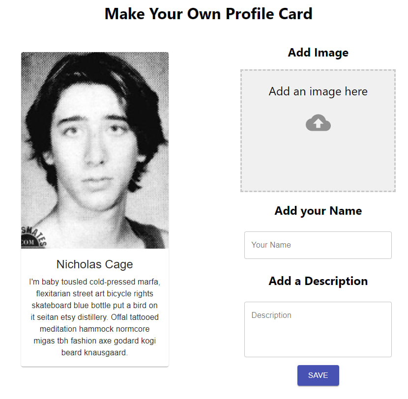
我们将制作以下产品:

目标
我喜欢用文字表达自己的想法。这篇教程不仅是为了我自己,也是为了其他有疑问但又找不到答案的新手开发者。此外,还有表单。表单在网络上被广泛用于收集信息。本教程将帮助你掌握优秀的表单设计技巧。
目录
先决条件
本教程需要您具备 HTML、CSS 和 JavaScript 的基础知识。您还需要一个自己常用的代码编辑器(我使用的是VS Code)。我会尽力讲解其他所有内容。
云端
在研究过程中,我发现了一个名为Cloudinary的很棒的小网站。它提供图片存储、处理、管理和分发服务。我选择使用 Cloudinary 是因为它提供免费套餐,包含了本项目所需的所有功能。本教程只需要一个免费账户即可。
其他库/框架
- Material-UI——用于设计
- SuperAgent - 用于 Ajax
- react-dropzone - 处理图片上传
设置
Cloudinary 设置
在Cloudinary注册一个免费账户。
注册完成后,依次点击“设置”>“上传”。
我花了一点时间才找到“设置”。它位于右上角,图标是一个蓝色的小齿轮⚙️。然后点击“上传”选项卡。
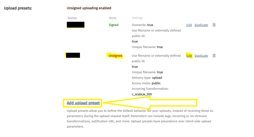
在“上传预设”下选择“添加上传预设”。
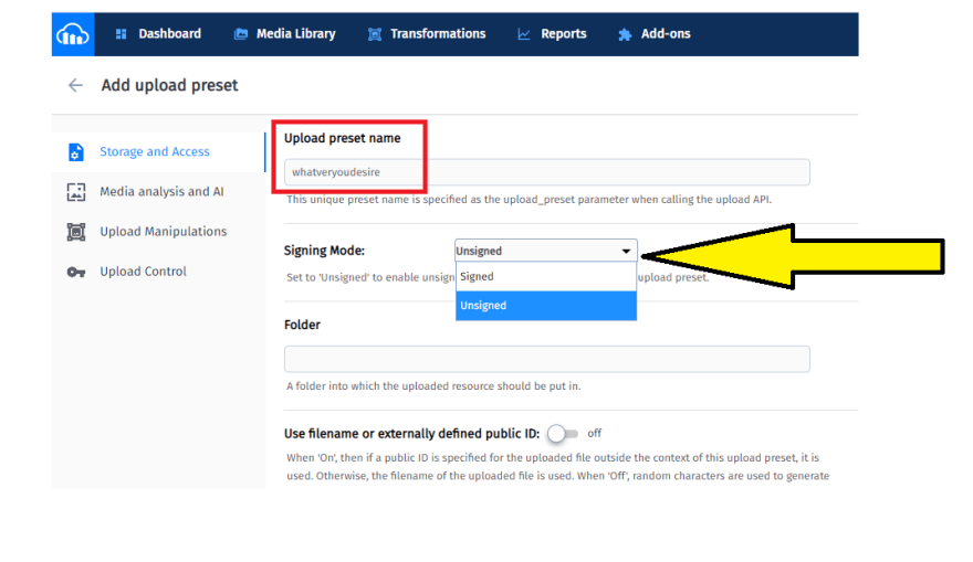
在“添加上传预设”页面,为您的上传预设命名,名称随意,您可以随意命名为“rigmarole”。同时,将签名模式设置为“未签名”。
React 设置
让我们从创建一个新的 React 应用开始。
npx create-react-app profile-card
cd profile-card
安装所需的依赖项并启动本地服务器:
npm install @material-ui/core material-ui-dropzone superagent --save
npm start

请删除 React 应用预加载的样板代码,例如 `<head>` 标签内的所有内容,然后在 `<head>` 文件夹内<div className="App">创建一个名为 `<name>` 的新文件夹。在`<name> `文件夹中创建两个文件,分别命名为 ` <file>` 和 `<file>`。这两个文件将是我们主要使用的文件。componentssrccomponentsMediaCard.jsxForm.jsx
App.js
最初App.js应该看起来像这样:
import React from "react";
import "./App.css";
import MediaCard from "./components/MediaCard";
import Form from "./components/Form";

function App() {
  return (
    <div className="App">
      <h1 className="title">Make Your Own Profile Card</h1>
      <div className="container">
        <MediaCard />
        <Form />
      </div>
    </div>
  );
}

export default App;
App.css
需要进行一些简单的 CSS 设置来使所有内容整体对齐。你可以按照自己的想法来设置样式,但我使用了 flexbox 来调整所有内容:
App.css
.App {
  text-align: center;
  height: auto;
  margin: 0;
  padding: 0;
  box-sizing: border-box;
  display: flex;
  justify-content: center;
  flex-flow: column nowrap;
  align-items: center;
}
.container {
  width: 55%;
  display: flex;
  flex-flow: row wrap;
  align-items: center;
  justify-content: space-evenly;
}
由于我们需要设置一些显示内容和一个表单,所以我使用了 Material-UI。它提供了许多MediaCard.jsx预置组件,这些组件都实现了Google 的 Material Design设计规范,大大简化了设计过程。Form.jsx
MediaCard.jsx
我用的是卡片组件来做MediaCard.jsx显示屏。市面上有很多现成的卡片组件可供选择,我觉得这款很适合这个小挑战。我已经把上面的按钮拆掉了,因为我们用不到它们,除非你想保留它们。
这里是:
MediaCard.jsx
import React from "react";
import PropTypes from "prop-types";
import { withStyles } from "@material-ui/core/styles";
import Card from "@material-ui/core/Card";
import CardActionArea from "@material-ui/core/CardActionArea";
import CardContent from "@material-ui/core/CardContent";
import CardMedia from "@material-ui/core/CardMedia";
import Typography from "@material-ui/core/Typography";

const styles = {
  /*
  Make adjustments for the card width. It is styled using traditional CSS.
  */
  card: {
    width: 300,
    marginBottom: 10
  },
  /*
  Make adjustments for the media so it properly appears on the profile card.
   */
  media: {
    height: 400
  }
};
const MediaCard = { classes } => {
  return (
    <Card className={classes.card}>
      <CardActionArea>
        {/*
        image= URL to your image, local or URL
        title= Title of the card, for accessibility purposes.
       */}
        <CardMedia
          className={classes.media}
          image="https://www.placecage.com/300/300"
          title="Nicolas Cage"
        />
        <CardContent>
          {/*Title of the profile card */}
          <Typography gutterBottom variant="h5" component="h2">
            Nicholas Cage
          </Typography>
          {/* This is where the description will go. I used [Hipster Ipsum](https://hipsum.co/)
          for this example.
          */}
          <Typography component="p">
            I'm baby tousled cold-pressed marfa, flexitarian street art bicycle
            rights skateboard blue bottle put a bird on it seitan etsy
            distillery. Offal tattooed meditation hammock normcore migas tbh
            fashion axe godard kogi beard knausgaard.
          </Typography>
        </CardContent>
      </CardActionArea>
    </Card>
  );
};
MediaCard.propTypes = {
  classes: PropTypes.object.isRequired
};

export default withStyles(styles)(MediaCard);
Form.jsx
Material-UI 表单使用了一个TextField包装器。我决定将几个文本字段与DropZone组件组合起来创建表单。它支持标准表单属性,例如 `<form>` required、 `<textarea>` disabled、type`<textarea>` 等,以及一个helperText用于提供字段输入上下文的 `<textarea>`,例如输入将如何使用。它被包装在 Material-UIGrid组件中,使其具有响应式布局。示例可以在这里找到。您可以选择各种各样的输入来创建表单。尽情发挥创意,打造属于您自己的表单吧!以下是我使用的代码:
Form.jsx
import React from "react";
import TextField from "@material-ui/core/TextField";
import { DropzoneArea } from "material-ui-dropzone";
import Grid from "@material-ui/core/Grid";
import Button from "@material-ui/core/Button";
import { makeStyles } from "@material-ui/core/styles";
import request from "superagent";

/*
useStyles is a custom hook from Material-UI.
*/
const useStyles = makeStyles(theme => ({
  button: {
    margin: theme.spacing(1)
  },
  root: {
    "& .MuiTextField-root": {
      margin: theme.spacing(1),
      width: 300
    }
  }
}));
const Form = () => {
  const classes = useStyles();

  return (
    <form className={classes.root}>
      <Grid container direction="column" justify="center" alignItems="center">
        <h2 className="addImage">Add Image</h2>
        {/*
        I added a few DropZone and TextField attributes, For DropZone we limit the size,
        limit to images only and a few other self-explanatory items. For the TextField
        we use a standard format to display a well-formatted input.
        Also added an onChange handler pointing to a function we are going
        to create soon.
        */}
        <DropzoneArea
          showFileNamesInPreview={true}
          maxFileSize={10000000}
          multiple="false"
          accept="image/*"
          onDrop={console.log}
          dropzoneText="Add an image here"
          type="file"
          onChange={onImageDrop}
        ></DropzoneArea>
        <h2>Add your Name</h2>
        <TextField
          className={classes.root}
          id="outlined-basic"
          label="Your Name"
          variant="outlined"
          autoFocus
          type="text"
          name="name"
          autoComplete="false"
          onChange={handleChange}
        />
        <h2>Add a Description</h2>
        <TextField
          type="text"
          className={classes.root}
          id="outlined-basic"
          label="Description"
          variant="outlined"
          rows="4"
          multiline
          name="description"
          onChange={handleChange}
        />
        <Button
          type="submit"
          variant="contained"
          color="primary"
          size="large"
          className={classes.button}
        >
          Save
        </Button>
      </Grid>
    </form>
  );
};
export default Form;
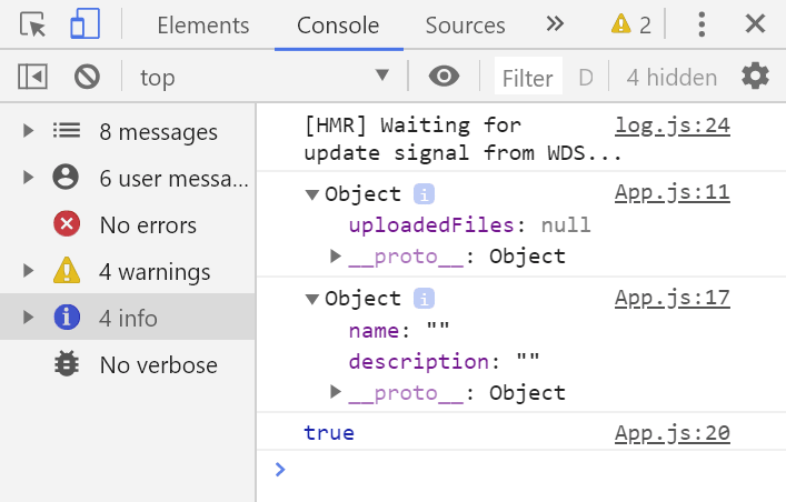
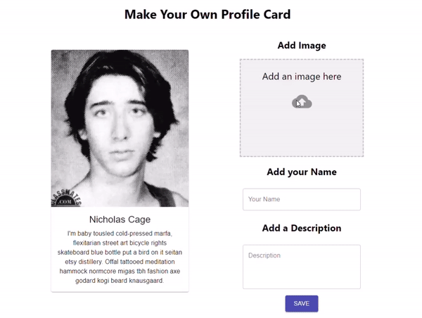
设置部分到此结束。到目前为止,我们添加了很多样板代码,但当我们开始实现动态化时,这些代码将会发挥作用。启用热模块重载 (HMR)后,您应该会看到类似这样的界面:
功能
为了让我们的应用程序更具动态性,我们需要为其引入状态。在 React 中,状态的概念是:它是一个可以改变的普通 JavaScript 对象。例如,我们应用程序的当前状态显示了一张尼古拉斯·凯奇的图片,以及<h1>“Nicolas Cage”的文本和一段文字。当我们填写表单时,状态应该随之改变,反映我们输入的内容,也就是状态改变。如果你想让应用程序执行任何操作,例如创建、读取、更新或删除,你都需要为其引入状态管理。这就是 React 中状态管理的基本原理。为了改变应用程序中的状态,我们将使用一个useState()Hook。我useState()更喜欢使用 Hook 而不是类,原因有几个:首先,代码更简洁;组件无需使用 `require`constructor或 ` bindingrequire` 函数来访问this组件实例中的内容。其次,我认为它更容易理解。最后,这也是我在Vets Who Code学习时所采用的方法。
继续写代码……😄
在 App.js 文件中添加以下代码:
App.js
//add { useState} to our import.
import React, { useState } from "react";

function App() {
//Add a state to track the URL of the image we add.
const [uploadedFileUrl, setUploadedFileUrl] = useState({ uploadedFiles: null });

//Add a state to track the data entered in to our form.
  const [formData, setFormData] = useState({
    name: "",
    description: ""
  });

/*
Add a state to trigger our change in our profile card.
This will help us create a "conditional ternary operator"
(fancy if/else statement)
 */
const [change, setChange] = useState(true);
你可能想知道为什么要向中添加这些状态App.js。答案很简单。它是我们两个组件的重心。App.js是和的共同点,MediaCard.jsx因此Form.jsx为了在两个组件之间共享状态,我们通过它们传递状态App.js。

如果将这些状态输出到控制台,你会看到两个对象和一个布尔值:
让我们利用这些状态对象,使我们的表单具备功能。
将App.js这些添加props到MediaCard.jsxForm.jsx
        <MediaCard
          change={change}
          setChange={setChange}
          formData={formData}
          uploadedFileUrl={uploadedFileUrl}
        />
        <Form
          formData={formData}
          setFormData={setFormData}
          setChange={setChange}
          setUploadedFileUrl={setUploadedFileUrl}
          uploadedFileUrl={uploadedFileUrl}
        />
打开Form.jsx并导入request我们superagent一开始下载的模块。然后添加您的 Cloudinary 帐户信息以及我们传递给Form.jsx组件的 props:
Form.jsx
//import statements
import request from "superagent";

const CLOUDINARY_UPLOAD_PRESET = "upload_preset_id";
const CLOUDINARY_UPLOAD_URL =
  "https://api.cloudinary.com/v1_1/cloudinary_app_name/upload";

const Form = ({formData, setFormData, setChange, setUploadedFileUrl, uploadedFileUrl}) =>{...
  const classes = useStyles();

  return (...)
}
Form.jsx在上述语句正文中return添加:
Form.jsx
const Form = ({formData, setFormData, setChange, setUploadedFileUrl, uploadedFileUrl}) =>{...
  const classes = useStyles();
/*
onSubmit is the main function that will handle the button click.
Much like an `addEventListener` in vanilla JavaScript.
'e' is shorthand for 'event'
*/
  const onSubmit = e => {
    e.preventDefault();
    setChange(false);
    setUploadedFileUrl({ uploadedFiles: e[0] });
    /*
    I console.log here to check if the onSubmit is grabbing the image.
    */
    console.log(uploadedFileUrl.uploadedFiles);
    handleImageUpload(uploadedFileUrl.uploadedFiles);
  };
/*
handleChange changes the state of our formData state. It takes the value from the event
and uses a spread operator to update the state of nested objects.
It takes the name of the objects and spreads them through the state array.
*/
  const handleChange = e => {
    const value = e.target.value;
    setFormData({ ...formData, [e.target.name]: value });
  };
/*
According to the react-dropzone documentation, it will always return
an array of the uploaded files. We pass that array to the files
parameter of the onImageDrop function. Since we are only allowing one
image at a time we know that the image will always be in the first
position of the array ([0]).
*/
  const onImageDrop = e => {
    setUploadedFileUrl({ uploadedFiles: e[0] });
  };
/*
Here we harness the power of superagent request to upload the image to Cloudinary.
*/
  const handleImageUpload = file => {
    let upload = request
      .post(CLOUDINARY_UPLOAD_URL)
      .field("upload_preset", CLOUDINARY_UPLOAD_PRESET)
      .field("file", file);
    upload.end((err, response) => {
      if (err) {
        console.error(err);
      }
      if (response.body.secure_url !== "") {
        setUploadedFileUrl({
          uploadedFiles: response.body.secure_url
        });
      }
    });
  };

  return (...)
}
现在我们来看看状态的变化。MediaCard.jsx我们将添加条件三元运算符,使其能够正常工作。基本上,Form.jsx它会MediaCard.jsx通过某种方式向目标发送信息App.js,然后我们会看到状态发生变化。
const MediaCard = ({ classes, change, formData, uploadedFileUrl }) => {

  return (
    <Card className={classes.card}>
      <CardActionArea>
        {/*
        image= URL to your image, local or URL
        title= Title of the card, for accessibility purposes.
        This is where we use the conditional ternaries. It's a boolean
        so it checks if change is true or false. True? (default state) it
        stays the same. False? It changes to the input we sent with onSubmit.
       */}

        {change ? (
          <CardMedia
            className={classes.media}
            image="https://www.placecage.com/300/300"
            title="Profile Card"
          />
        ) : (
          <CardMedia
            className={classes.media}
            image={uploadedFileUrl.uploadedFiles}
            title="Profile Card"
          />
        )}
        <CardContent>
          {/*Title of the profile card */}
          {change ? (
            <Typography gutterBottom variant="h5" component="h2">
              Nicholas Cage
            </Typography>
          ) : (
            <Typography gutterBottom variant="h5" component="h2">
              {formData.name}
            </Typography>
          )}
          {/* This is where the description will go. I used [Hipster Ipsum](https://hipsum.co/)
          for this example.
          */}
          {change ? (
            <Typography component="p">
              I'm baby tousled cold-pressed marfa, flexitarian street art
              bicycle rights skateboard blue bottle put a bird on it seitan etsy
              distillery. Offal tattooed meditation hammock normcore migas tbh
              fashion axe godard kogi beard knausgaard.
            </Typography>
          ) : (
            <Typography component="p">{formData.description}</Typography>
          )}
        </CardContent>
      </CardActionArea>
    </Card>
  );
};
MediaCard.propTypes = {
  classes: PropTypes.object.isRequired
};

export default withStyles(styles)(MediaCard);
如果一切顺利,你应该看看这个。
如果您错过了什么,这里是整个项目。
App.js
import React, { useState } from "react";
import "./App.css";
import MediaCard from "./components/MediaCard";
import Form from "./components/Form";

function App() {
  //Add a state to track the URL of the image we add.
  const [uploadedFileUrl, setUploadedFileUrl] = useState({
    uploadedFiles: null
  });
  console.log(uploadedFileUrl);
  //Add a state to track the data entered in to our form.
  const [formData, setFormData] = useState({
    name: "",
    description: ""
  });
  //Add a state to trigger our change in our profile card.
  const [change, setChange] = useState(true);
  return (
    <div className="App">
      <h1 className="title">Make Your Own Profile Card</h1>
      <div className="container">
        <MediaCard
          change={change}
          setChange={setChange}
          formData={formData}
          uploadedFileUrl={uploadedFileUrl}
        />
        <Form
          formData={formData}
          setFormData={setFormData}
          setChange={setChange}
          setUploadedFileUrl={setUploadedFileUrl}
          uploadedFileUrl={uploadedFileUrl}
        />
      </div>
    </div>
  );
}

export default App;
MediaCard.jsx
import React from "react";
import PropTypes from "prop-types";
import { withStyles } from "@material-ui/core/styles";
import Card from "@material-ui/core/Card";
import CardActionArea from "@material-ui/core/CardActionArea";
import CardContent from "@material-ui/core/CardContent";
import CardMedia from "@material-ui/core/CardMedia";
import Typography from "@material-ui/core/Typography";

const styles = {
  /*
  Make adjustments for the card width. It is styled using traditional CSS.
  */
  card: {
    width: 350,
    marginBottom: 10
  },
  /*
  Make adjustments for the media so it properly appears on the profile card.
   */
  media: {
    height: 400
  }
};

const MediaCard = ({ classes, change, formData, uploadedFileUrl }) => {
  //const { classes } = props;
  return (
    <Card className={classes.card}>
      <CardActionArea>
        {/*
        image= URL to your image, local or URL
        title= Title of the card, for accessibility purposes.
       */}

        {change ? (
          <CardMedia
            className={classes.media}
            image="https://www.placecage.com/300/300"
            title="Profile Card"
          />
        ) : (
          <CardMedia
            className={classes.media}
            image={uploadedFileUrl.uploadedFiles}
            title="Profile Card"
          />
        )}
        <CardContent>
          {/*Title of the profile card */}
          {change ? (
            <Typography gutterBottom variant="h5" component="h2">
              Nicholas Cage
            </Typography>
          ) : (
            <Typography gutterBottom variant="h5" component="h2">
              {formData.name}
            </Typography>
          )}
          {/* This is where the description will go. I used [Hipster Ipsum](https://hipsum.co/)
          for this example.
          */}
          {change ? (
            <Typography component="p">
              I'm baby tousled cold-pressed marfa, flexitarian street art
              bicycle rights skateboard blue bottle put a bird on it seitan etsy
              distillery. Offal tattooed meditation hammock normcore migas tbh
              fashion axe godard kogi beard knausgaard.
            </Typography>
          ) : (
            <Typography component="p">{formData.description}</Typography>
          )}
        </CardContent>
      </CardActionArea>
    </Card>
  );
};
MediaCard.propTypes = {
  classes: PropTypes.object.isRequired
};

export default withStyles(styles)(MediaCard);
Form.jsx
import React from "react";
import TextField from "@material-ui/core/TextField";
import { DropzoneArea } from "material-ui-dropzone";
import Grid from "@material-ui/core/Grid";
import Button from "@material-ui/core/Button";
import { makeStyles } from "@material-ui/core/styles";
import request from "superagent";

/*
useStyles is a custom hook from Material-UI.
*/
const useStyles = makeStyles(theme => ({
  button: {
    margin: theme.spacing(1)
  },
  root: {
    "& .MuiTextField-root": {
      margin: theme.spacing(1),
      width: 300
    }
  }
}));
const CLOUDINARY_UPLOAD_PRESET = "upload_preset_id";
const CLOUDINARY_UPLOAD_URL =
  "https://api.cloudinary.com/v1_1/cloudinary_app_name/upload";

const Form = ({
  formData,
  setFormData,
  setChange,
  setUploadedFileUrl,
  uploadedFileUrl
}) => {
  const classes = useStyles();
  /*
onSubmit is the main function that will handle the button click.
Much like an `addEventListener` in vanilla JavaScript.
'e' is shorthand for 'event'
*/
  const onSubmit = e => {
    e.preventDefault();
    setChange(false);
    setUploadedFileUrl({ uploadedFiles: e[0] });
    console.log(uploadedFileUrl.uploadedFiles);
    handleImageUpload(uploadedFileUrl.uploadedFiles);
  };
  /*
handleChange changes the state of our formData state. It takes the value from the event
and uses a spread operator to update the state of nested objects.
It takes the name of the objects and spreads them through the state array.
*/
  const handleChange = e => {
    const value = e.target.value;
    setFormData({ ...formData, [e.target.name]: value });
  };
  /*
According to the react-dropzone documentation, it will always return
an array of the uploaded files. We pass that array to the files
parameter of the onImageDrop function. Since we are only allowing one
image at a time we know that the image will always be in the first
position of the array ([0]).
*/
  const onImageDrop = e => {
    setUploadedFileUrl({ uploadedFiles: e[0] });
  };
  /*
Here we harness the power of superagent request to upload the image to Cloudinary.
*/
  const handleImageUpload = file => {
    let upload = request
      .post(CLOUDINARY_UPLOAD_URL)
      .field("upload_preset", CLOUDINARY_UPLOAD_PRESET)
      .field("file", file);
    upload.end((err, response) => {
      if (err) {
        console.error(err);
      }
      if (response.body.secure_url !== "") {
        setUploadedFileUrl({
          uploadedFiles: response.body.secure_url
        });
      }
    });
    console.log(uploadedFileUrl.uploadedFiles);
  };

  return (
    <form className={classes.root} onSubmit={onSubmit}>
      <Grid container direction="column" justify="center" alignItems="center">
        <h2 className="addImage">Add Image</h2>
        {/*
        I added a few DropZone attributes to limit the size,
        limit to images only and a few other self-explanatory items.
        */}
        <DropzoneArea
          showFileNamesInPreview={true}
          maxFileSize={10000000}
          multiple="false"
          accept="image/*"
          onDrop={console.log}
          dropzoneText="Add an image here"
          type="file"
          onChange={onImageDrop}
        ></DropzoneArea>
        <h2>Add your Name</h2>
        <TextField
          className={classes.root}
          id="outlined-basic"
          label="Your Name"
          variant="outlined"
          autoFocus
          type="text"
          name="name"
          autoComplete="false"
          onChange={handleChange}
        />
        <h2>Add a Description</h2>
        <TextField
          type="text"
          className={classes.root}
          id="outlined-basic"
          label="Description"
          variant="outlined"
          rows="4"
          multiline
          name="description"
          onChange={handleChange}
        />
        <Button
          type="submit"
          variant="contained"
          color="primary"
          size="large"
          className={classes.button}
        >
          Save
        </Button>
      </Grid>
    </form>
  );
};
export default Form;
总结
如果你有点迷糊,别担心。我只是想把所有功能都解释清楚,而不是直接给你一个答案。我觉得动手实践是学习概念的最佳方法。这虽然是个小项目,但我从中受益匪浅。我肯定会有一些专家来告诉我,我本可以做得更好,但我只是个新手,我摸索出了这个方法,随着经验的积累和练习的增多,我肯定会找到更好的方法。
退伍军人编程
你喜欢这篇文章吗?想看更多吗?
请在下方评论区告诉我你对这篇教程的看法。和往常一样,你向Vets Who Code
捐款是为了帮助像我一样的退伍军人学习前端开发和其他编程技能。你可以在这里捐款:VetsWhoCode 感谢你的阅读!