使用 TailwindCSS 创建仪表板 - 第二部分
先决条件
由于本文是《使用 TailwindCSS 创建仪表板 - 第 1 部分》的续篇,如果您还没有阅读过该部分,建议您在开始之前先阅读一下。
你跟上进度了吗?我们继续吧。
创建样式指南页面
要开始创建我们的样式指南,我们需要一个新页面,让我们进入NuxtJS项目的pages文件夹,并添加一个名为styleguide.vue的文件。
页面创建完成后,我添加了一个带有主标题的页眉,然后开始思考要在页面上显示哪些部分。由于所有部分的标题和间距都相似,我创建了一个名为StyleSection.vue的组件来包含所有这些部分。
因此,styleguide.vue模板将多次引用StyleSection组件,每次引用的内容都不同:
<template>
  <div>
    <header>
      <h1>Style guide</h1>
    </header>
    <style-section>
      <template slot="title">Colors</template>
      <colors />
    </style-section>
    <style-section>
      <template slot="title">
        <!-- Title: as Gradients, Font Style & Icons -->
      </template>
      <!-- Component: as Gradients, Fonts & Icons -->
    </style-section>
  </div>
</template>
在页面脚本中,我们只需导入每个组件即可。
由于它们只会出现在样式指南页面中,所以我创建了一个名为styleguide 的文件夹,位于 components文件夹中,我将在其中存储它们。
<script>
import StyleSection from '~/components/styleguide/StyleSection.vue'
import Colors from '~/components/styleguide/Colors.vue'
/* Import Components */

export default {
  components: {
    StyleSection,
    Colors,
    /* Components imported */
  }
}
</script>
建筑构件
现在让我们来看看这些新组件及其功能。
- 样式部分
正如我之前提到的,为了拥有统一的风格,并且能够在同一个框中表示每个组件,我在styleguide文件夹中创建了StyleSection.vue。
  <template>
    <div class="pt-8">
      <header class="pb-6">
        <h3 class="capitalize">
          <slot name="title"></slot>
        </h3>
        <p class="pb-2 border-b border-gray-300 text-gray-700">
          <slot name="title"></slot> for app theme.
        </p>
      </header>
      <slot />
    </div>
  </template>
在这里,我只是简单地添加了各部分之间的间距以及基础标题的样式。我创建了两个插槽来加载动态内容。在名为title的插槽中,我们将接收styleguide.vue传递给我们的部分标题:
<template slot="title">Colors</template>
在未命名的 插槽中,我们将接收style-section标签内的其余内容。
现在我们已经了解了每个部分的基本内容,让我们来看看每个部分具体讲的是什么吧!
- 颜色
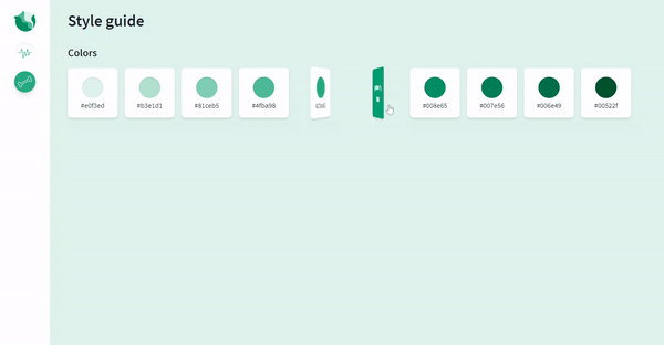
我首先要向大家展示的是我们的调色板。
正如我在这篇文章中想讨论的,在TailwindCSS中添加新实用程序的可能性,我选择了一个类似翻转卡片的过渡效果来添加 Tailwind 默认配置中不存在的新属性,让我们看看如何添加它们!
我们将通过创建自己的插件来添加一个新的实用程序,我将要解释的所有内容都取自官方文档。
我们首先需要做的是获取tailwindcss/plugin并将其保存在tailwind.config.js的一个变量中。
const plugin = require('tailwindcss/plugin')
要使用它,我们需要将以下代码添加到配置文件中的插件部分。在这个插件中,我们将定义翻转卡片过渡所需的 CSS 属性,这些属性在 Tailwind 的初始样式中没有包含。
这些属性包括perspective、backface-visibility、transform-style(值为preserve-3d)和rotateY变换。
  plugin(function({ addUtilities }) {
      const newUtilities = {
        '.rotate-y-0': {
          transform: 'rotateY(0deg)'
        },
        '.rotate-y-180': {
          transform: 'rotateY(180deg)'
        },
        '.transform-style-3d': {
          transformStyle: 'preserve-3d'
        },
        '.backface-hidden': {
          backfaceVisibility: 'hidden'
        },
        '.perspective': {
          perspective: '1000px'
        }
      }

      addUtilities(newUtilities, ['group-hover'])
   })
请注意,当我们通过addUtilities添加新类时,我们会传入一个包含group-hover伪类变体的数组,这样当鼠标悬停在特定的父元素上时,这些类就可以应用于子元素。
伪类变体允许您在鼠标悬停、聚焦等情况下设置元素样式。点击此处查看多种变体。
现在我们已经创建了类,让我们用它们来进行过渡吧!
我在styleguide文件夹中创建了一个名为Colors.vue的组件。在该组件中,我定义了一个flexbox来容纳每种颜色类型的色调列表。
  <template>
    <div>
      <div
        v-for="color in colors"
        :key="color.name"
        class="flex flex-wrap justify-center md:justify-start -mr-4"
      >
        <div v-for="item in color.palette" :key="item.color" class="pr-4 pb-4">
          <!-- Flip Card template -->
        </div>
      </div>
    </div>
  </template>
在这种情况下,我们有两种颜色,原色和互补色,每种颜色都有十种色调。
为了表示它们,我创建了一个名为colors 的数组,其中包含两个对象:一个用于存储主色及其调色板,另一个用于存储互补色。数组结构如下:
  colors: [
    {
      name: 'primary',
      palette: [
        {
          color: 'bg-primary-50',
          hex: '#e0f3ed',
          name: '50'
        },
        /* Other options */
      ]
    },
    {
      name: 'complementary',
      palette: [
        {
          color: 'bg-complementary-50',
          hex: '#fce5ea',
          name: '50'
        },
        /* Other options */
      ]
    }
  ]
翻转卡片元素
flexbox容器内部将放置带有翻转过渡效果的颜色卡,效果如下:
为了实现这一目标,我们需要考虑以下三件事:
-
卡片的大小不能是动态的,必须在父元素和子元素的面上都定义一个静态大小。父元素会有一个透视效果,以便在旋转时产生深度感。
-
旋转操作将由一个中间元素执行,如下面的代码所示,该元素使用了group-hover属性。父元素必须包含group类,group-hover属性才能生效。
-
过渡效果将保持3D 不变,并且必须在中间元素(例如旋转)中执行。
生成的模板如下:
  <div class="group perspective w-28 h-28 cursor-pointer">
    <div class="relative group-hover:rotate-y-180 transform-style-3d transition ease-linear duration-700">
      <div class="card__front">
        <!-- Front Card Content (Show by default) -->
      </div>
      <div :class="item.color" class="card__back">
        <!-- Back Card Content -->
      </div>
    </div>
  </div>
对于各个面,我们必须定义一个通用样式,例如位置、大小和背面可见性(隐藏),这是创建卡片效果所必需的。此外,还需要定义其绕 Y 轴旋转的特定样式,以便在对中间元素执行组悬停操作时,显示正确的面。
因此,我们需要定义两个类card__front和card__back,以便赋予它们这些样式。
  <style scoped>
  .card__front,
  .card__back {
    @apply backface-hidden absolute top-0 right-0 rounded-lg flex flex-col items-center justify-center shadow-md w-28 h-28;
  }
  .card__front {
    @apply bg-white z-10 rotate-y-0 p-4;
  }
  .card__back {
    @apply rotate-y-180 p-2;
  }
  </style>
现在,我们可以添加任意数量的颜色和色调啦!!✨

- 梯度
你可能觉得教程会很长,但别担心,内容较多的组件是上一个。剩下的部分就轻而易举了!
对于这个组件,我想向你介绍一下TailwindCSS 插件包,它不止一次地让我免去了自己创建插件的麻烦。
要使用它,我们只需要将其安装在本地即可。
npm i tailwindcss-plugins -D
并将我们想要使用的插件(在本例中为gradients )添加到tailwind.config.js文件的 plugins 部分:
  plugins: [
    require('tailwindcss-plugins/gradients')
  ]
要定义渐变,我们只需进入主题并添加渐变,如下所示。然后,我们选择渐变的名称,将其用作背景名称(bg-name-selected),并创建一个数组来设置渐变的方向和颜色:
  theme: {
    ...,
    gradients: (theme) => ({
      'primary-45': [
        '45deg',
        theme('colors.primary.700'),
        theme('colors.primary.300')
      ],
      'complementary-45': [
        '45deg',
        theme('colors.complementary.700'),
        theme('colors.complementary.300')
      ],
      'mixed-45': [
        '45deg',
        theme('colors.complementary.300'),
        theme('colors.primary.100')
      ]
    })
  },
现在我们可以在模板中将其用作bg-primary-45、bg-complementary-45和bg-mixed-45。通过将这些变量作为对象的 gradient 属性传递,我们可以动态地表示我们拥有的渐变,如下所示:
  <template>
    <div class="flex flex-wrap -mr-4 md:-mr-6">
      <div
        v-for="item in gradients" :key="item.name"
        class="w-full sm:w-1/2 md:w-56 pr-4 md:pr-6 pb-4"
      >
        <!-- Color composition -->
        <p
          :class="item.gradient /* item.gradient == 'bg-name-gradient' */"
        >{{ item.name }}</p>
      </div>
    </div>
  </template>

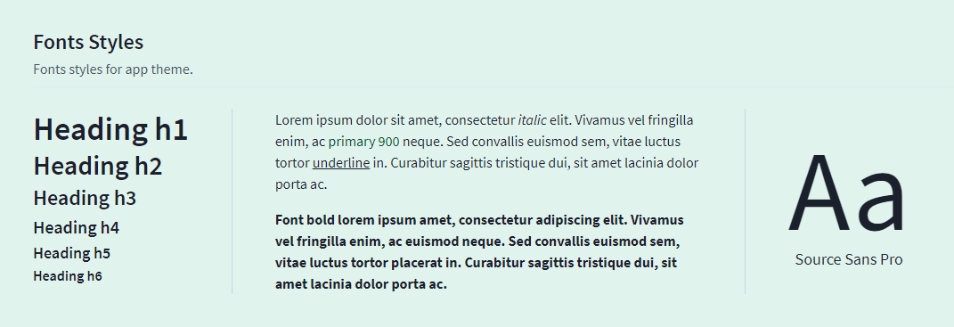
- 字体样式
Fonts.vue组件并不神秘。由于我们的基础文件中已经定义了所有样式,我只是简单地展示了仪表盘上可能出现的每个元素的示例。
这将是生成的模板及其视图:
  <template>
    <div class="flex flex-wrap items-stretch justify-start">
      <header
        class="w-full lg:w-auto border-gray-400 pb-6 border-b lg:pb-0 lg:border-b-0 lg:pr-12 lg:border-r"
      >
        <h1>Heading h1</h1>
        <!-- Other Headings -->
      </header>
      <div
        class="w-full lg:max-w-xl border-gray-400 py-6 border-b lg:py-0 lg:border-b-0 lg:px-12 lg:border-r"
      >
        <p>
          Lorem ipsum
          <span class="italic">italic</span>
          <span class="text-primary-900">primary 900</span>
          <span class="underline">underline</span>
          ...
        </p>
        <p class="pt-4 font-bold">
          Font bold lorem ipsum.
        </p>
      </div>
      <p
        class="w-full lg:w-auto border-gray-400 pt-6 lg:pt-0 lg:pl-12 flex flex-col items-center justify-center"
      >
        <span class="text-giant leading-none">Aa</span>
        <span class="text-lg">Source Sans Pro</span>
      </p>
    </div>
  </template>
- 图标
最后,最后一个部分!我决定展示我们目前在仪表盘上使用的图标。
随着我添加新图标,我会不断扩展这个组件。
为了避免选择颜色的麻烦,并能展示所有可选颜色,我决定创建一个颜色选择器。简单来说,当你点击其中一个颜色时,chosenColor变量就会更新,并且带有fill-current属性的图标将应用该样式。
这里我把组件留给你看一下,因为我需要边做边添加图标,所以我创建了一个名为icon-style 的类以便能够重用它。
与以往一样, TailwindCSS的样式使用@apply。
  <template>
    <div :class="choosenColor">
      <ul class="w-full flex flex-wrap items-center pb-4">
        <li><p class="pr-4 pb-2 text-gray-700">Select color</p></li>
        <li v-for="color in colors" :key="color.bg" class="pr-2">
          <button
            :class="color.bg" class="w-6 h-6 rounded-full focus:outline-none"
            :aria-label="'Choose ' + color.text" @click="choosenColor = color.text"
          />
        </li>
      </ul>
      <div class="flex flex-wrap">
        <p class="pb-4 pr-4"><bone class="icon-style" /></p>
        <!-- Other Icons -->
      </div>
    </div>
  </template>

  <script>
  import Bone from '~/components/icons/Bone.vue'
  /* Other Icons */

  export default {
    components: {
      Bone,
      /* Other Icons imported */
    },
    data() {
      return {
        colors: [
          { text: 'text-primary-500', bg: 'bg-primary-500' },
          /* Other options */
        ],
        choosenColor: ''
      }
    }
  }
  </script>

  <style scoped>
  .icon-style {
    @apply bg-white rounded-lg shadow-md p-2 w-12 h-12 fill-current;
  }
  </style>
太好了!仪表盘的进度报告已经讲完了,如果你有任何疑问或者想指导下一篇帖子,欢迎随时联系我💜
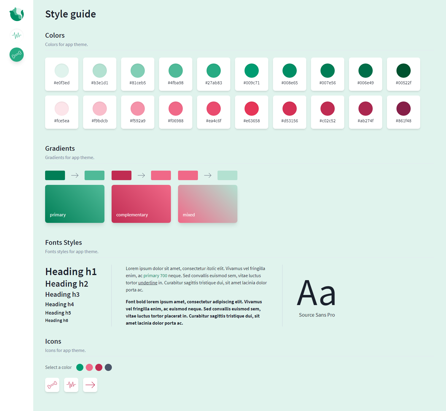
这是我们的风格指南页面:
项目已上传至 Heroku,您现在可以在Cabbage Dashboard中查看结果💜
记住,我会不断添加新的组件并解释相关流程,但你也可以告诉我你想在这个系列中看到的任何功能🥰
我把代码仓库链接放在这里,方便你查看:https://github.com/Dawntraoz/cabbage
文章来源:https://dev.to/dawntraoz/create-a-dashboard-with-tailwindcss-part-2-1m5c