用 React 创建具有裁剪和旋转功能的图像上传模态框
介绍:
欢迎阅读这篇关于如何在React中创建具有裁剪和旋转功能的图像模态框的教程!在本篇博文中,我们将探讨如何利用react-easy-crop库的强大功能,在 React 中构建一个类似于 GitHub 或 Facebook 等流行平台上的交互式图像模态框。
这里是实时演示链接。
在实时演示中,您可以体验图像模态框的全部功能,包括裁剪和旋转功能。
本教程的重点是开发一种解决方案,最大限度地减少组件间不必要的 props 传递。为此,我们将利用 React 的 Context API。通过创建 Context Provider 和自定义 Hook,我们可以无缝地在组件间共享数据和函数,而无需在组件树中逐级传递 props。
那么,让我们深入了解一下如何创建一个图像模态框,允许用户裁剪和旋转他们上传的图像。
项目设置:
要开始实现我们的图像模态框,我假设您已经搭建好了一个 React 项目。UI 方面,我使用的是 Tailwind CSS,但您可以根据需要使用任何 UI 库。
图像裁剪和旋转功能将使用react-easy-crop库。该库提供了一种简单直观的方式,可以在 React 组件中裁剪图像和视频并与之交互。本教程中
我们还会用到heroicons和classnames库。要安装所有库及其依赖项,请打开终端并导航到您的项目目录。运行以下命令:
npm install react-easy-crop classnames @heroicons/react
#or
yarn add react-easy-crop classnames @heroicons/react
现在我们react-easy-crop已经安装了必要的库和其他库,接下来让我们创建必要的组件并实现图像模态功能。
创建基础组件:
在本教程中,我们将创建两个必要的底层组件Button,Modal它们将用于我们的图像模态框,该模态框具有裁剪和旋转功能。让我们仔细看看它们:
// src/components/base/Button.jsx

import classNames from 'classnames';

const Button = ({ variant, className, children, ...rest }) => {
  return (
    <button
      type="button"
      className={classNames(className, 'hover:shadow-inner px-4 py-2 text-sm rounded-3xl', {
        'bg-blue-500 text-white hover:bg-blue-700 hover:text-white': variant === 'primary',
        'bg-red-500 text-white hover:bg-red-700 hover:text-white': variant === 'secondary',
        'bg-white text-gray-900 hover:bg-white hover:text-blue-500': variant === 'light'
      })}
      {...rest}
    >
      {children}
    </button>
  );
};

export default Button;
该Button组件是一个可重复使用且用途广泛的元素,使我们能够轻松创建不同样式的按钮。
//src/components/base/Modal.jsx
import classNames from 'classnames';
const Modal = ({ open, children }) => {
return (
<div
className={classNames('fixed z-10 overflow-y-auto top-0 w-full left-0', {
hidden: !open
})}
id="modal"
>
<div className="flex items-center justify-center min-height-100vh pt-4 px-4 pb-20 text-center sm:block sm:p-0">
<div className="fixed inset-0 transition-opacity">
<div className="absolute inset-0 bg-gray-900 opacity-75"></div>
<span className="hidden sm:inline-block sm:align-middle sm:h-screen"></span>
<div
className="inline-block align-center bg-white rounded-lg text-left overflow-hidden shadow-xl transform transition-all sm:my-8 sm:align-middle sm:max-w-sm sm:w-full"
role="dialog"
aria-modal="true"
aria-labelledby="modal-headline"
>
<div className="bg-white px-4 pt-5 pb-4 sm:p-6 sm:pb-4">{children}</div>
</div>
</div>
</div>
</div>
);
};
export default Modal;
模态组件在我们的图像模态实现中扮演着至关重要的角色。它负责在模态叠加层中显示内容,为图像编辑提供简洁专注的界面。
创建图像裁剪上下文:
构建具有裁剪和旋转功能的图像模态框的关键在于有效地管理状态。为此,我们将创建一个 React 上下文,为需要访问此状态的组件提供必要的数据和函数。
//src/providers/ImageCropProvider.jsx

/* eslint-disable react-refresh/only-export-components */
import { createContext, useCallback, useContext, useState } from 'react';
import getCroppedImg from '../helpers/cropImage';

export const ImageCropContext = createContext({});

const defaultImage = null;
const defaultCrop = { x: 0, y: 0 };
const defaultRotation = 0;
const defaultZoom = 1;
const defaultCroppedAreaPixels = null;

const ImageCropProvider = ({
  children,
  max_zoom = 3,
  min_zoom = 1,
  zoom_step = 0.1,
  max_rotation = 360,
  min_rotation = 0,
  rotation_step = 5
}) => {
  const [image, setImage] = useState(defaultImage);
  const [crop, setCrop] = useState(defaultCrop);
  const [rotation, setRotation] = useState(defaultRotation);
  const [zoom, setZoom] = useState(defaultZoom);
  const [croppedAreaPixels, setCroppedAreaPixels] = useState(defaultCroppedAreaPixels);

  const onCropComplete = useCallback((_croppedArea, croppedAreaPixels) => {
    setCroppedAreaPixels(croppedAreaPixels);
  }, []);

  const handleZoomIn = () => {
    if (zoom < max_zoom) {
      setZoom(zoom + zoom_step * 2);
    }
  };

  const handleZoomOut = () => {
    if (zoom > min_zoom) {
      setZoom(zoom - zoom_step * 2);
    }
  };

  const handleRotateCw = () => {
    setRotation(rotation + rotation_step);
  };

  const handleRotateAntiCw = () => {
    setRotation(rotation - rotation_step);
  };

  const getProcessedImage = async () => {
    if (image && croppedAreaPixels) {
      const croppedImage = await getCroppedImg(image, croppedAreaPixels, rotation);
      const imageFile = new File([croppedImage.file], `img-${Date.now()}.png`, {
        type: 'image/png'
      });
      return imageFile;
    }
  };

  const resetStates = () => {
    setImage(defaultImage);
    setCrop(defaultCrop);
    setRotation(defaultRotation);
    setZoom(defaultZoom);
    setCroppedAreaPixels(defaultCroppedAreaPixels);
  };

  return (
    <ImageCropContext.Provider
      value={{
        image,
        setImage,
        zoom,
        setZoom,
        rotation,
        setRotation,
        crop,
        setCrop,
        croppedAreaPixels,
        setCroppedAreaPixels,
        onCropComplete,
        getProcessedImage,
        handleZoomIn,
        handleZoomOut,
        handleRotateAntiCw,
        handleRotateCw,
        max_zoom,
        min_zoom,
        zoom_step,
        max_rotation,
        min_rotation,
        rotation_step,
        resetStates
      }}
    >
      {children}
    </ImageCropContext.Provider>
  );
};

export const useImageCropContext = () => useContext(ImageCropContext);

export default ImageCropProvider;
在提供的代码片段中,我们定义了该ImageCropProvider组件。该组件充当上下文提供程序,并用 `<context>` 包裹其子组件ImageCropContext.Provider。让我们仔细看看它是如何工作的:
这ImageCropContext将是我们用于图像裁剪和旋转的集中式状态管理解决方案。
它是一个功能组件,接受几个与图像裁剪和旋转配置相关的可选属性。这些属性包括max_zoom`<property> ` min_zoom、` zoom_step<property> `、` max_rotation<property>`、min_rotation`<property>`、`<property>` 和 `<property> rotation_step`,可以根据应用程序的具体需求进行自定义。
它将封装以下状态变量:
image:保存我们要裁剪和旋转的选定图像。crop:表示当前作物区域的 x 和 y 坐标。rotation:跟踪图像的旋转角度。zoom:控制图像的缩放级别。croppedAreaPixels:存储裁剪区域的像素值。
此外,我们还将加入几个实用函数,以便对图像进行缩放和旋转:
handleZoomIn:增加缩放级别(最高可达最大值)。handleZoomOut降低缩放级别(降至最小值)。handleRotateCw将图像顺时针旋转指定角度。handleRotateAntiCw将图像逆时针旋转指定的角度。resetStates重置所有状态。
此外,我们创建了一个名为 `.` 的函数getProcessedImage。该函数使用一个辅助函数getCroppedImg(本代码片段中未显示)根据原始图像、裁剪区域的像素值和旋转角度提取裁剪后的图像。结果是一个表示裁剪后图像的新文件对象,该对象可用于后续上传到服务器。
此外,我们还创建了一个自定义钩子,以便在其他组件中useImageCropContext使用它。ImageCropContext
构建自定义裁剪组件
现在,是时候构建一个利用该react-easy-crop库的自定义裁剪器组件了,该组件允许用户交互式地裁剪和旋转他们选择的图像。
//src/components/cropper/Cropper.jsx

import EasyCropper from 'react-easy-crop';
import { useImageCropContext } from '../../providers/ImageCropProvider';

const Cropper = () => {
  const { image, zoom, setZoom, rotation, setRotation, crop, setCrop, onCropComplete } =
    useImageCropContext();

  return (
    <EasyCropper
      image={image || undefined}
      crop={crop}
      zoom={zoom}
      rotation={rotation}
      cropShape="round"
      aspect={1}
      onCropChange={setCrop}
      onCropComplete={onCropComplete}
      onZoomChange={setZoom}
      setRotation={setRotation}
      showGrid={false}
      cropSize={{ width: 185, height: 185 }}
      style={{
        containerStyle: {
          height: 220,
          width: 220,
          top: 8,
          bottom: 8,
          left: 8,
          right: 8
        }
      }}
    />
  );
};

export default Cropper;
该组件充当库与我们Cropper之间的接口。它使用自定义钩子从上下文中访问必要的状态和函数。其工作原理如下:react-easy-cropImageCropContextuseImageCropContext
- 访问上下文数据:
- 我们使用
useImageCropContext钩子来访问数据ImageCropContext。该钩子返回一个对象,其中包含裁剪和旋转功能所需的状态变量和函数。 - 解构这个对象,我们可以访问
image,,,,,,,和。zoomsetZoomrotationsetRotationcropsetCroponCropComplete
- 我们使用
- EasyCropper 组件:
- 该
EasyCropper组件是从react-easy-crop库中导入的。它是一个功能全面的组件,提供交互式图像裁剪和旋转功能。 - 我们向该组件传递各种属性,以便根据状态控制其行为
ImageCropContext。
- 该
- 道具和功能:
image我们将上下文中的图像作为 prop 传递给裁剪器,EasyCropper以便它知道要裁剪和显示哪张图像。如果图像未定义,裁剪器最初不会渲染任何图像。crop、zoom、 和rotation:这些属性与上下文中的相应状态变量相关联,确保裁剪器反映当前的crop、zoom、 和rotation值。cropShape并且aspect:我们将其设置cropShape为“圆形”和aspect1,表示裁剪区域应为圆形,并保持 1:1 的纵横比。onCropChange,,onZoomChange和setRotation:每当用户与裁剪器交互时,这些回调属性都会更新上下文中的相应状态变量。
- 短款上衣的搭配:
- 我们提供了一个样式对象来自定义组件的外观
EasyCropper。在本例中,我们将裁剪容器的高度和宽度设置为 220 像素,并在边缘周围添加 8 像素的边距以创建一些内边距。
- 我们提供了一个样式对象来自定义组件的外观
构建图像裁剪模态内容
有了 ` ImageCropContextand`Cropper组件,我们就可以构建图像裁剪模态框的核心部分了。ImageCropModalContent用户可以在该组件中与裁剪器交互,调整缩放和旋转角度,并上传新的图像进行裁剪和旋转。
首先,我们需要为裁剪容器添加一些 CSS 样式。请将以下 CSS 代码添加到文件中index.css:
.crop-container {
  position: relative;
  width: 236px;
  height: 236px;

  background: linear-gradient(to right, #cbd4e1 8px, transparent 8px) 0 0,
    linear-gradient(to right, #cbd4e1 8px, transparent 8px) 0 100%,
    linear-gradient(to left, #cbd4e1 8px, transparent 8px) 100% 0,
    linear-gradient(to left, #cbd4e1 8px, transparent 8px) 100% 100%,
    linear-gradient(to bottom, #cbd4e1 8px, transparent 8px) 0 0,
    linear-gradient(to bottom, #cbd4e1 8px, transparent 8px) 100% 0,
    linear-gradient(to top, #cbd4e1 8px, transparent 8px) 0 100%,
    linear-gradient(to top, #cbd4e1 8px, transparent 8px) 100% 100%;

  background-repeat: no-repeat;
  background-size: 70px 70px;
}
.reactEasyCrop_CropArea {
  color: rgba(255, 255, 255, 0.8) !important;
}
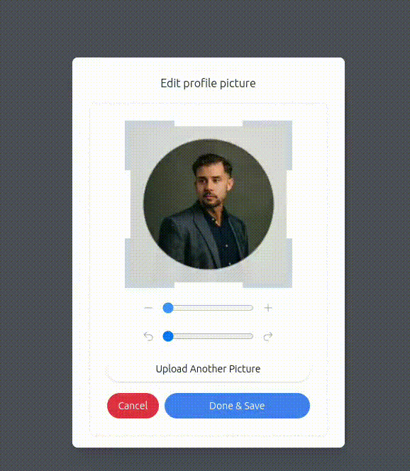
现在,我们继续进行ImageCropModalContent组件的实现:
//src/components/ImageCropModalContent.jsx

import { readFile } from '../helpers/cropImage';
import { useImageCropContext } from '../providers/ImageCropProvider';
import Button from '../components/base/Button';
import Cropper from '../components/cropper/Cropper';
import { RotationSlider, ZoomSlider } from '../components/cropper/Sliders';

const ImageCropModalContent = ({ handleDone, handleClose }) => {
  const { setImage } = useImageCropContext();

  const handleFileChange = async ({ target: { files } }) => {
    const file = files && files[0];
    const imageDataUrl = await readFile(file);
    setImage(imageDataUrl);
  };

  return (
    <div className="text-center relative">
      <h5 className="text-gray-800 mb-4">Edit profile picture</h5>
      <div className="border border-dashed border-gray-200 p-6 rounded-lg">
        <div className="flex justify-center">
          <div className="crop-container mb-4">
            <Cropper />
          </div>
        </div>
        <ZoomSlider className="mb-4" />
        <RotationSlider className="mb-4" />
        <input
          type="file"
          multiple
          onChange={handleFileChange}
          className="hidden"
          id="avatarInput"
          accept="image/*"
        />

        <Button variant="light" className="shadow w-full mb-4 hover:shadow-lg">
          <label htmlFor="avatarInput">Upload Another Picture</label>
        </Button>
        <div className="flex gap-2">
          <Button variant="secondary" onClick={handleClose}>
            Cancel
          </Button>
          <Button variant="primary" className="w-full" onClick={handleDone}>
            Done & Save
          </Button>
        </div>
      </div>
    </div>
  );
};

export default ImageCropModalContent;
让我们来探索一下该组件的代码ImageCropModalContent以及ZoomSlider和RotationSlider组件,这些组件使用户能够在裁剪图像时控制缩放和旋转。
- 该
ImageCropModalContent组件首先从 . 导入readFile函数helpers/cropImage。该函数负责读取图像文件并返回其数据 URL。 - 我们还导入了
useImageCropContext钩子函数,以便从上下文中providers/ImageCropProvider访问该函数。当用户选择图像文件时,该函数会读取图像数据 URL 并使用 . 将其设置到上下文中。setImagehandleFileChangesetImage - 渲染裁剪器:该
ImageCropModalContent组件渲染裁剪器组件,允许用户交互式地裁剪和旋转选定的图像。crop-container为了便于样式设置,我们将裁剪器放置在一个带有特定类名的容器中。 - 缩放和旋转滑块:我们从导入了
ZoomSlider和RotationSlider组件components/cropper/Sliders。这些滑块分别负责调整图像的缩放级别和旋转角度。 - 文件输入和上传按钮:我们添加了一个文件类型的输入框,允许用户上传另一张图片进行裁剪。
handleFileChange当用户选择新的图片文件时,此功能将被触发。用户点击“上传另一张图片”按钮后,文件输入框将打开,用户可以选择新的图片。 - 操作按钮:我们提供了两个操作按钮:“取消”和“完成并保存”。点击“取消”按钮会关闭图像裁剪模态框,“完成并保存”按钮会保存裁剪后的图像并触发一个
handleDone函数,该函数作为 prop 从父组件传递过来。
缩放滑块和旋转滑块组件:
`x`ZoomSlider和 `y`RotationSlider组件允许用户在裁剪图像时控制缩放级别和旋转角度。它们与useImageCropContext钩子交互,以访问必要的状态和函数ImageCropContext。
//src/components/cropper/Sliders.jsx

import { useImageCropContext } from '../../providers/ImageCropProvider';
import {
  ArrowUturnLeftIcon,
  ArrowUturnRightIcon,
  MinusIcon,
  PlusIcon
} from '@heroicons/react/24/solid';
import classNames from 'classnames';

export const ZoomSlider = ({ className }) => {
  const { zoom, setZoom, handleZoomIn, handleZoomOut, max_zoom, min_zoom, zoom_step } =
    useImageCropContext();

  return (
    <div className={classNames(className, 'flex items-center justify-center gap-2')}>
      <button className="p-1" onClick={handleZoomOut}>
        <MinusIcon className="text-gray-400 w-4" />
      </button>
      <input
        type="range"
        name="volju"
        min={min_zoom}
        max={max_zoom}
        step={zoom_step}
        value={zoom}
        onChange={e => {
          setZoom(Number(e.target.value));
        }}
      />
      <button className="p-1" onClick={handleZoomIn}>
        <PlusIcon className="text-gray-400 w-4" />
      </button>
    </div>
  );
};

export const RotationSlider = ({ className }) => {
  const {
    rotation,
    setRotation,
    max_rotation,
    min_rotation,
    rotation_step,
    handleRotateAntiCw,
    handleRotateCw
  } = useImageCropContext();

  return (
    <div className={classNames(className, 'flex items-center justify-center gap-2')}>
      <button className="p-1" onClick={handleRotateAntiCw}>
        <ArrowUturnLeftIcon className="text-gray-400 w-4" />
      </button>
      <input
        type="range"
        name="volju"
        min={min_rotation}
        max={max_rotation}
        step={rotation_step}
        value={rotation}
        onChange={e => {
          setRotation(Number(e.target.value));
        }}
      />
      <button className="p-1" onClick={handleRotateCw}>
        <ArrowUturnRightIcon className="text-gray-400 w-4" />
      </button>
    </div>
  );
};
图像处理辅助函数:
为了实现图像裁剪和旋转,我们使用了一组参考react-easy-crop库示例编写的辅助函数。这些函数简化了图像处理任务,使我们能够生成最终的裁剪图像。
//src/helpers/cropImage.js

export const readFile = file => {
  return new Promise(resolve => {
    const reader = new FileReader();
    reader.addEventListener('load', () => resolve(reader.result), false);
    reader.readAsDataURL(file);
  });
};

export const createImage = url =>
  new Promise((resolve, reject) => {
    const image = new Image();
    image.addEventListener('load', () => resolve(image));
    image.addEventListener('error', error => reject(error));
    image.setAttribute('crossOrigin', 'anonymous'); // needed to avoid cross-origin issues on CodeSandbox
    image.src = url;
  });

export function getRadianAngle(degreeValue) {
  return (degreeValue * Math.PI) / 180;
}

/**
 * Returns the new bounding area of a rotated rectangle.
 */
export function rotateSize(width, height, rotation) {
  const rotRad = getRadianAngle(rotation);

  return {
    width: Math.abs(Math.cos(rotRad) * width) + Math.abs(Math.sin(rotRad) * height),
    height: Math.abs(Math.sin(rotRad) * width) + Math.abs(Math.cos(rotRad) * height)
  };
}

const getCroppedImg = async (
  imageSrc,
  pixelCrop = { x: 0, y: 0 },
  rotation = 0,
  flip = { horizontal: false, vertical: false }
) => {
  const image = await createImage(imageSrc);
  const canvas = document.createElement('canvas');
  const ctx = canvas.getContext('2d');

  if (!ctx) {
    return null;
  }

  const rotRad = getRadianAngle(rotation);

  // calculate bounding box of the rotated image
  const { width: bBoxWidth, height: bBoxHeight } = rotateSize(image.width, image.height, rotation);

  // set canvas size to match the bounding box
  canvas.width = bBoxWidth;
  canvas.height = bBoxHeight;

  // translate canvas context to a central location to allow rotating and flipping around the center
  ctx.translate(bBoxWidth / 2, bBoxHeight / 2);
  ctx.rotate(rotRad);
  ctx.scale(flip.horizontal ? -1 : 1, flip.vertical ? -1 : 1);
  ctx.translate(-image.width / 2, -image.height / 2);

  // draw rotated image
  ctx.drawImage(image, 0, 0);

  // croppedAreaPixels values are bounding box relative
  // extract the cropped image using these values
  const data = ctx.getImageData(pixelCrop.x, pixelCrop.y, pixelCrop.width, pixelCrop.height);

  // set canvas width to final desired crop size - this will clear existing context
  canvas.width = pixelCrop.width;
  canvas.height = pixelCrop.height;

  // paste generated rotate image at the top left corner
  ctx.putImageData(data, 0, 0);

  // As Base64 string
  // return canvas.toDataURL('image/jpeg');

  // As a blob
  return new Promise(resolve => {
    canvas.toBlob(file => {
      resolve({ file, url: URL.createObjectURL(file) });
    }, 'image/jpeg');
  });
};

export default getCroppedImg;
我们在组件中使用了这些函数。其他函数将在内部使用这些函数readFile。getCroppedImg
实现 ImageModal 和 ImageCrop 交互
在本节中,我们将创建该ImageCrop组件,它作为用户与图像模态框交互并裁剪/旋转其所选图像的主要入口点。
//src/components/ImageCrop.jsx

import { useState } from 'react';
import user1 from '../assets/user_1.png';
import Modal from '../components/base/Modal';
import { readFile } from '../helpers/cropImage';
import ImageCropModalContent from './ImageCropModalContent';
import { useImageCropContext } from '../providers/ImageCropProvider';

const ImageCrop = () => {
  const [openModal, setOpenModal] = useState(false);
  const [preview, setPreview] = useState(user1);

  const { getProcessedImage, setImage, resetStates } = useImageCropContext();

  const handleDone = async () => {
    const avatar = await getProcessedImage();
    setPreview(window.URL.createObjectURL(avatar));
    resetStates();
    setOpenModal(false);
  };

  const handleFileChange = async ({ target: { files } }) => {
    const file = files && files[0];
    const imageDataUrl = await readFile(file);
    setImage(imageDataUrl);
    setOpenModal(true);
  };

  return (
    <div className="bg-gray-100 h-screen flex justify-center items-center">
      <input
        type="file"
        onChange={handleFileChange}
        className="hidden"
        id="avatarInput"
        accept="image/*"
      />
      <label htmlFor="avatarInput" className="cursor-pointer">
        <img
          src={preview}
          height={192}
          width={192}
          className="object-cover rounded-full h-48 w-48"
          alt=""
        />
      </label>

      <Modal open={openModal} handleClose={() => setOpenModal(false)}>
        <ImageCropModalContent handleDone={handleDone} handleClose={() => setOpenModal(false)} />
      </Modal>
    </div>
  );
};

export default ImageCrop;
与 ImageCropContext 集成:
- 状态和图像预览:该
ImageCrop组件设置了两个状态变量: `<image_visibility>`openModal和 `preview<image_prereview>`。`openModal<image_visibility>`:控制图像模态框的可见性。初始值为 `<image_visibility>`,当用户上传图像或打开模态框进行裁剪和旋转时,其false值变为 ` <image_visibility>`。`<image_prereview> `:保存裁剪前要显示为预览的图像的 URL。初始值为默认图像(在本例中为 `<image_visibility>`)。truepreviewuser1 - 图片上传和模态交互:用户可以点击该
img元素(隐藏文件输入框的标签)。点击后,文件输入对话框打开,允许用户选择要上传的图片。handleUpload当选择图片时,会触发一个函数。该函数会读取图片数据 URLreadFile,并使用 `set_image_url` 将其设置到上下文中setImage。同时,它还会将openModal状态设置为true`true`,从而显示图片模态框。 ImageModal集成ImageCropModalContent:该ImageCrop组件渲染一个ImageModal模态框组件。ImageCropModalContent模态框的内容作为参数传递。Modal 组件的 open 属性控制模态框的可见性,而handleClose作为该handleClose属性传递的函数用于在需要时关闭模态框。- 图像裁剪和预览更新:当用户完成裁剪并点击“完成并保存”按钮时
handleDone,会调用此函数。在函数内部,我们调用另一个函数从上下文中获取裁剪后的图像。然后,使用 `getFile()` 方法将获取到的文件对象转换为预览 URL ,并将其设置到预览状态,从而使用裁剪后的版本更新图像预览。最后,我们将 `setProperty()` 设置为 `false`,关闭图像模态框。ImageCropModalContenthandleDonegetCroppedImageURL.createObjectURLopenModal
集成 ImageCrop 组件
该App组件作为另一个ImageCrop组件的容器,为用户提供与图像模态框交互的界面,用于裁剪和旋转图像。在您的情况下,它可能是另一个组件。
//src/App.jsx

import ImageCrop from './components/ImageCrop';
import ImageCropProvider from './providers/ImageCropProvider';

const App = () => {
  return (
    <div className="bg-gray-100 h-screen flex justify-center items-center">
      <ImageCropProvider>
        <ImageCrop />
      </ImageCropProvider>
    </div>
  );
};

export default App;
在App组件中,我们ImageCrop使用 `<div>` 包裹组件ImageCropProvider。这确保ImageCrop组件可以访问 `<div> ImageCropContext`,从而有效地管理图像裁剪和旋转的状态和功能。
该ImageCrop组件是用户选择、裁剪和旋转图像的主要交互点。
通过ImageCrop使用 `<div>` 包裹组件ImageCropProvider,它可以访问必要的上下文,并与Cropper组件和 `<div>`无缝交互ImageCropModalContent。
结论
总之,我们已成功使用 React 和react-easy-crop相关库实现了具有裁剪和旋转功能的图像模态框。通过利用ImageCropProvider上下文,我们有效地管理了图像操作所需的状态和操作,从而减少了组件之间过多的 prop 传递。
有了这个图像模态框,用户现在可以轻松编辑他们的个人资料图片或上传到应用程序的任何其他图片。
以下是完整的项目代码链接:GitHub 代码源
希望这篇教程能帮助你扩展 React 知识,并启发你将这些技巧应用到你自己的项目中。
文章来源:https://dev.to/mizanrifat/creating-an-image-upload-modal-with-crop-and-rotate-functionality-in-react-5cbd